












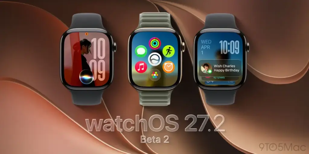
For many power users of the Apple Watch, the transition to watchOS 27 brought with it a jarring change to the device’s navigation experience. Specifically, the removal of the long-standing ability to access the App Switcher via a simple double-click of the Digital Crown left many feeling as though they had lost a vital tool for multitasking on their wrists. However, hope for a return to form has arrived. As of the release of watchOS 27.2 beta 2, Apple appears to be actively working to restore the functionality of the App Switcher, albeit through a slightly different interaction method than long-time users might remember.
Earlier today, Apple officially rolled out watchOS 27.2 beta 2 to its developer community. This update arrives less than a week after the release of the initial beta, signaling that the company is moving quickly through its testing cycle for this particular point release. While point releases are often relegated to minor performance improvements and bug fixes, this second beta contains a functional adjustment that addresses one of the most vocal criticisms regarding the recent evolution of the watchOS interface.
The frustration among the user base has been palpable since the release of watchOS 27. Many users, including tech journalists who rely on their Apple Watches for efficient, on-the-go productivity, noted that the omission of the App Switcher shortcut significantly hindered their ability to jump between frequently used applications. Previously, the double-click gesture served as a quick, muscle-memory-driven way to manage background tasks. Without it, the operating system felt less fluid, and the lack of a viable alternative for rapid task switching left many wishing for a restoration of the feature.

In his analysis of the situation earlier this month, industry observer and writer Zac Hall highlighted the significant friction introduced by this change. He noted that the absence of a quick-access switcher meant that users were forced to navigate back to the home screen or the app dock to transition between tasks, a process that felt clunky and inefficient compared to the previous standard. His call for Apple to reconsider the design choice resonated with a significant portion of the user base who felt that the utility of the device had been diminished in the name of interface simplification.
While it is important to clarify that Apple has not opted to bring back the original "double-click the Digital Crown" gesture in this specific build, the company has effectively restored the App Switcher functionality itself. The reintroduction of this feature represents a clear response to the feedback loop between Apple and its user base. It demonstrates that the software engineering teams are paying close attention to how users actually interact with their devices in day-to-day scenarios, particularly when those interactions involve core navigation paradigms that have been established over many years.
The new implementation, which was first brought to light by the Apple Den Discord server and subsequently amplified by social media users, utilizes a different gesture to trigger the multitasking interface. Rather than relying on the physical buttons of the Apple Watch, the feature is now accessed by pressing and holding the bottom of the display while inside an active application. This "long-press" gesture serves as a new gateway to the multitasking view, providing a functional bridge back to the capabilities users had come to rely on.

Once this gesture is initiated, the behavior of the App Switcher remains consistent with the expectations established by earlier versions of watchOS. Users are presented with a familiar layout of their recently used apps, which can then be scrolled through by turning the Digital Crown. This allows for the same tactile, precise navigation that defined the feature in the past. Furthermore, the ability to manage these apps remains intact; by swiping left on any card in the stack, users can reveal the familiar "X" button, which allows them to close an app and clear it from the background entirely.
The discovery, highlighted in a post by a user named Bones on the social platform X, serves as a testament to the community-driven nature of beta testing. By sharing the discovery, users are able to provide collective feedback to Apple regarding whether this new gesture feels as intuitive or as efficient as the previous hardware-based shortcut. The swift adoption and testing of this feature in the beta environment suggest that while Apple is committed to refining its interface, it is also pragmatic enough to realize when a feature has become indispensable to the user experience.
As with any software still in the testing phase, it is essential to remember that the inclusion of this feature in watchOS 27.2 beta 2 does not guarantee its presence in the final, public version of the software. Apple often experiments with various UI and UX configurations during the beta period, and the final decision on whether to implement a feature—or how exactly that feature should behave—is often finalized only shortly before the public rollout. However, the fact that the company has taken the time to re-engineer the access method for the App Switcher provides a strong indication that a version of this feature will likely be present when the update is released to the general public, which is currently expected to occur next month.

The ongoing conversation surrounding these navigation changes highlights the delicate balance Apple must strike with the Apple Watch. Because the device occupies such a small screen, every interaction must be optimized for speed and accuracy. The "double-click" of the Digital Crown was a classic example of a "power user" shortcut—something that required a bit of learning but paid off in efficiency over the long term. Replacing it with a touch-based gesture changes the ergonomic profile of the device, shifting the burden from the side button to the screen itself. Whether this change is viewed as an improvement or a compromise will likely depend on individual user preference and how they have integrated the Apple Watch into their daily workflows.
For those who have been vocal about the loss of the App Switcher, this development is a welcome sign of responsiveness. It serves as a reminder that the Apple Watch operating system is not a static environment, but rather one that continues to evolve in response to the practical needs of the people wearing it. As the beta cycle progresses, the focus will now shift to whether this long-press gesture provides a stable and reliable experience or if further refinements are needed before the official launch.
For now, developers and those participating in the public beta program have a new feature to evaluate. The return of the App Switcher, even in this modified form, restores a layer of multitasking control that many had feared was gone for good. As users continue to test the functionality, the broader discussion will likely center on whether the long-press approach offers the same level of accessibility as the physical button press, or if there is still room for further iteration. Regardless of the final outcome, the current trajectory of the watchOS 27.2 beta cycle suggests that Apple is listening, and that the feedback provided by the community is playing a meaningful role in shaping the future of the platform’s interface. Whether you have been struggling with the lack of multitasking or have simply been curious about how the system would evolve, the return of the App Switcher is undoubtedly one of the most significant adjustments in this update, marking a return to a more versatile and user-centric approach to wearable navigation.