











When it comes to digital design and user experience, even the smallest visual elements can carry immense weight in determining whether a user successfully navigates a website or encounters friction. Recent research from the Nielsen Norman Group (NN/g) provides a closer look at accordion icons, examining why certain symbols succeed while others cause confusion. The findings highlight persistent issues with split menus, the hazards of mismatched link actions between icons and text labels, and the definitive reasoning behind why the humble caret remains the safest and most reliable icon choice for web interfaces.
For designers and developers alike, determining the most reliable icon to signal expansion and collapsing in accordions has long been a subject of debate. Is there really a noticeable difference in user comprehension when choosing between carets, chevrons, arrows, and triangles? According to recent usability studies, the answer is a definitive yes. Beyond basic recognition, the research uncovers critical insights regarding split menus—where text labels and icons drive entirely different actions—and reinforces why simplicity continues to outperform complex visual signifiers.
No Icon Signifies Page Navigation
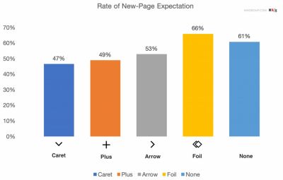
The foundational findings of the research are remarkably straightforward: when an interface utilizes no icon at all, users naturally expect that tapping or clicking on the menu item will take them directly to a new page. Users frequently struggle with custom or overly stylized icons because these graphic elements fail to clearly communicate that interacting with them will trigger an accordion drop-down rather than a standard page transition. Furthermore, user testing demonstrates that individuals tend to tap or click with roughly equal frequency on both the icon and the text label for the vast majority of standard UI icons.

Many modern web designs tend to overcomplicate things by incorporating an array of arrows and carets that shift direction dynamically depending on the current state of the accordion component. However, usability principles suggest that designers rarely need to utilize an arrow merely to indicate that a label links directly to a parent category.

The primary rule of thumb derived from these observations is strikingly simple: if an element is a standard text link, the most effective and universally understood method is to simply underline it. While an underlined text link might not feel visually groundbreaking or overly modern, it works flawlessly every single time because it relies on decades of established web conventions that users instinctively recognize.
Confusing Behavior With Arrows and Split Buttons
Using a right-facing arrow icon does not reliably create an expectation of navigating directly to a new page, just as using the same arrow pointing downward does not inherently guarantee that an accordion will open upon interaction. This ambiguity makes interface design tricky, particularly when teams attempt to implement complex layout patterns.
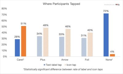
UX experts strongly advise against the implementation of split buttons for accordions. In a split button configuration, the text label links directly to an independent page, while the adjacent icon is assigned the separate task of opening the accordion menu. Usability testing consistently proves that this pattern is harmful and confusing, leading to frequent user errors and frustration.
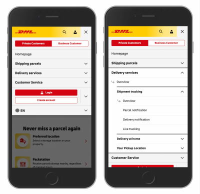
Instead of forcing split interactions, a much more reliable architecture allows users to tap anywhere on a main category header to expose the underlying sub-menu. To provide access to the top-level category page itself, designers can include a dedicated overview link safely contained within the expanded menu list itself. Real-world implementations from major global brands, such as DHL, successfully employ this pattern by omitting unnecessary arrows and split menus in favor of clear "Overview" links nestled inside each structured section.

Plus and Minus Signs Versus Arrows
While plus and minus signs, as well as directional arrows, are widely understood by web users to represent expanded and collapsed states, they are not without their flaws. Both sets of symbols are frequently overloaded with multiple meanings across different digital contexts.
A plus sign can signify a wide array of actions depending on the application, ranging from saving an item for later use to adding a product to a shopping cart or zooming into an image. This multifunctionality makes plus signs particularly confusing when applied to multi-level navigation structures where multiple tiers of menus might remain open simultaneously.
Similarly, directional arrows can imply scrolling, sliding through a carousel, locating the next search match, or jumping directly to a specific portion of a lengthy page. While plus symbols and arrows are certainly understood by the general public and remain functional in many scenarios, their inherent ambiguity means they can easily cause user hesitation if applied inconsistently.
Choosing the Safest Visual Path
The safest and most empirically supported choice for interface designers is to utilize a downward-pointing caret or triangle by default, shifting it to point upward or sideways upon user interaction. If a project requires an alternative approach, standard plus and minus symbols generally perform well when implemented with clear contextual boundaries.
Ultimately, web interfaces do not require an excessive array of supplementary icons or directional arrows to explain where links will lead. Split menus should similarly be approached with caution, as they frequently generate user error rather than improving navigation efficiency. A simpler, more streamlined approach—where a single interactive component performs a single, predictable action—offers the highest level of usability. When a direct link is necessary, underlining the title text provides the clearest possible signal to the user, proving once again that in web design, simpler is almost always better.