









In the ever-evolving landscape of social media interface design, platforms frequently experiment with nudges and UI modifications intended to drive specific user behaviors. While some changes—such as color-coded buttons or subtle iconography—are often viewed as minor inconveniences that users can easily ignore, others are so intrusive that they provoke genuine hostility. X, formerly known as Twitter, has recently introduced a new feature that falls squarely into the latter category, leaving many users frustrated and questioning the platform’s approach to monetization and user experience.
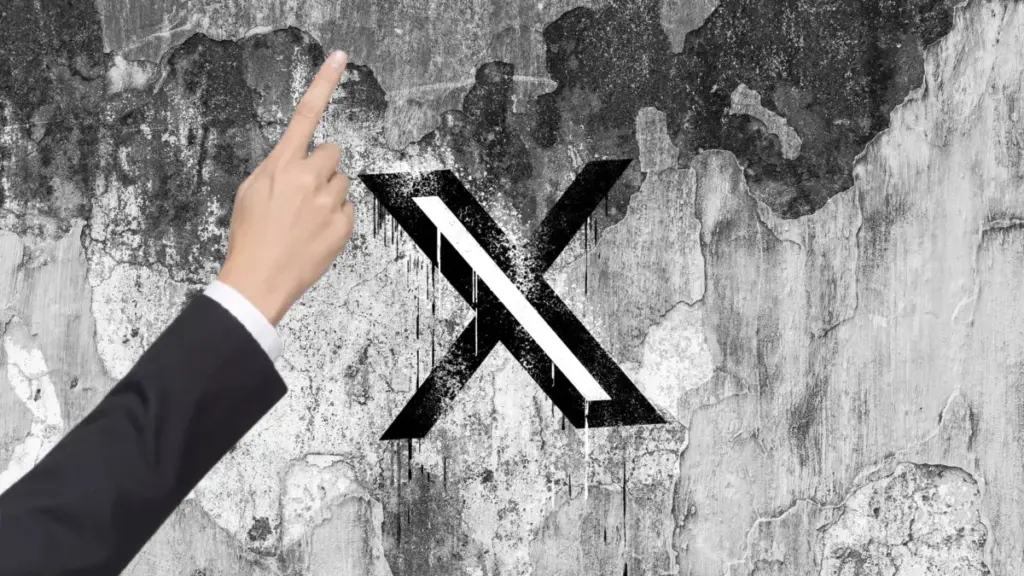
Over the past 24 hours, a growing number of X users have reported a startling and intrusive interface element: a large, disembodied hand that suddenly appears on the screen while they are drafting a post. This animated hand serves a singular, aggressive purpose—it points directly at the “Promote” button, which is the platform’s tool for users to pay to boost the visibility of their content. The sudden, unprompted appearance of this graphic has irked users across the board, with many taking to the platform itself to express their annoyance at what they perceive as an overly aggressive sales tactic.
A “Jumpscare” in the Compose Window
The timing of this feature, occurring just days before Halloween, has led some to speculate that the hand could be a seasonal prank designed to spook users. However, X has offered no official clarification or acknowledgment of the feature, leaving users to interpret it as a permanent, if controversial, addition to the platform’s UI. The implementation has been criticized not just for its persistence, but for its startling nature.

Ershad Kaleebullah, a vocal user on the platform, highlighted the disruptive nature of the design in a post that quickly gained traction. “WTF @elonmusk, if I wanted jump scares I would’ve watched a horror movie instead,” Kaleebullah wrote, adding a screenshot of the hand appearing exactly when the phrase “engagement farming” was being typed into the post editor. The implication is that the algorithm may be identifying specific keywords or patterns in user content to trigger these high-pressure prompts, further compounding the sense of intrusion for those who feel the platform is already too focused on monetization at the expense of authentic interaction.
For many, the psychological impact of the design outweighs its intended function. Even users who might have previously considered spending money to promote their content have noted that the experience was so jarring it discouraged them from completing the action. Rather than feeling like a helpful shortcut, the floating hand is being widely interpreted as a digital “hard sell” that interrupts the creative process of writing a tweet.
The “Nikita-Coded” Strategy
The aggressive nature of the prompt has drawn immediate comparisons to the growth-hacking strategies popularized during the tenure of Nikita Bier, X’s former head of product. Bier, who left the platform in August after nearly a year in the role, was known for implementing high-velocity product changes designed to spike engagement and user retention.
Dylan Abruscato, president of the TBPN podcast, described the new feature as “the most Nikita-coded thing I’ve ever seen,” noting that it perfectly encapsulates a philosophy that prioritizes raw metrics over user sentiment. “I was just about to post when this huge, in-your-face arm popped up pointing at the promote button,” Abruscato wrote in his post. He acknowledged the effectiveness of the design—noting that it is “so obstructive, yet so effective”—while simultaneously criticizing the user experience.
This sentiment reflects a broader tension within the X user base: while the platform is undoubtedly effective as a tool for real-time information, the constant churn of interface experiments aimed at extracting revenue can feel at odds with the user-first experience that many long-time users desire. The “Nikita-coded” label has become shorthand among industry observers for product decisions that favor extreme growth tactics, even when those tactics border on being hostile to the user.
Leadership Transitions and Product Strategy
The introduction of the “pointing hand” follows a significant leadership shakeup within the company. On Monday, Peter Sellis, who previously held senior product roles at Snap and Discord, officially took over as X’s new head of product. Sellis announced his appointment on the platform with a post that underscored his alignment with the company’s broader, long-term goals, stating, “I’m joining the team at @X to lead Product. I am a huge believer in @SpaceX’s mission to extend human consciousness to the stars, so it’s time to make shitposting multiplanetary.”
Sellis, who takes the reins from the previous product team, is stepping into a role defined by high-stakes experimentation. While it is currently unclear if the “pointing hand” feature is a direct result of Sellis’s immediate influence or if it was a project set in motion during the transition period, the feature is certainly consistent with the platform’s ongoing push to convert casual users into paying advertisers.
The strategy of nudging users toward the “Promote” feature is central to X’s business model under its current ownership. As the platform looks to diversify its revenue streams, transforming its vast user base into a self-service advertising engine has become a primary objective. However, the reception to this latest effort suggests that there is a fine line between a helpful UI nudge and a disruptive, user-hostile advertisement.
The Future of X’s Interface
As of now, X has not provided a comment on the rationale behind the pointing hand, nor has it indicated whether the feature is a temporary test or a permanent rollout. TechCrunch reached out to X for clarification on the matter, but no response was received at the time of publication.
The incident serves as a case study in the challenges of modern product design for global social media platforms. When a platform is as heavily used for personal expression as X, users often develop a strong sense of ownership over the interface. Consequently, changes that interrupt the fundamental act of communication—in this case, composing a post—are met with more intense scrutiny than changes to other parts of the site.
Whether or not the hand remains as the platform moves past the Halloween season will likely depend on the data. If the “obstructive” nature of the graphic leads to a measurable increase in promoted post conversions, X may choose to keep it or refine it into a more permanent feature. If, however, the user backlash translates into a measurable decrease in overall posting activity or an increase in user complaints, the company may be forced to pivot once again.
For now, the “pointing hand” remains a symbol of the current state of X: a platform in constant flux, where the boundaries between user experience, aggressive growth marketing, and experimentation are frequently tested. As users continue to share their frustrations, the industry will be watching to see how the new product leadership balances the pressure to generate revenue with the need to maintain a user base that feels respected rather than prodded. For the average user, the takeaway is clear: in the race to turn every interaction into a potential transaction, even the most basic interface elements are subject to change, often with little regard for the user’s comfort or desire for a streamlined experience.