










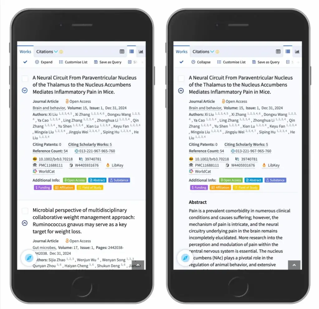
When designing digital interfaces, few elements are as ubiquitous or as deceptively simple as the accordion component. Used to tuck away dense blocks of content, navigation menus, and collapsible lists, accordions help maintain clean, clutter-free layouts. Yet, choosing the right visual indicator to show whether an accordion is expanded or collapsed remains a surprisingly frequent design pitfall. Recent usability research sheds new light on how users interpret these icons, why split menus create unnecessary friction, and which design practices offer the safest path forward.
For years, designers have debated the merits of various visual indicators, wondering if there is any noticeable, practical difference between carets, chevrons, standard arrows, and triangles. According to comprehensive usability studies from the Nielsen Norman Group (NN/g), the choice of icon does indeed matter significantly. More critically, the research highlights why split menus are actively harmful to user experience, why separating the functions of an icon and a text label causes frustration, and why the simple caret emerges as the most reliable choice across digital platforms.
Understanding User Expectations Around Icons and Navigation
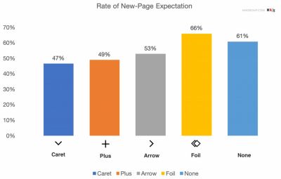
To understand how users interact with collapsible menus, researchers evaluated user behavior when encountering different visual signifiers, or a complete lack thereof. The findings regarding minimalist designs—those featuring no icon at all—were largely predictable. When a menu item appears without any icon, users overwhelmingly assume that tapping or clicking on the text will take them directly to a brand-new page.

Furthermore, users frequently struggle with custom or overly stylized icons because these graphics fail to establish a clear mental model indicating that an interaction will trigger an accordion expansion. In most tested scenarios involving standard icons, participants tended to click or tap roughly equally on both the text label and the icon itself. This finding underscores a vital usability principle: an icon does not merely serve as a passive visual decoration; it actively defines a major portion of the interactive hit area.

Many modern interface designs tend to overcomplicate things by introducing dynamic arrows and carets that point in various directions depending on the current state of the accordion. However, usability principles suggest that designers generally do not need to rely on arrows to signify a standard link to a category page. Instead, the most effective and universally understood rule of thumb is remarkably straightforward: if a piece of text is a link, the simplest and most reliable way to signal that functionality is to underline it. While plain underlined links might lack visual excitement, they function flawlessly every single time because they leverage decades of established web conventions.
Confusing Behavior With Arrows and Split Buttons
The research also closely examined directional indicators, revealing that using a right-facing arrow does not reliably create an expectation of navigating to a new page. Conversely, changing that same arrow to point downward does not consistently signal that an accordion will open upon interaction. This ambiguity makes arrows a less-than-ideal choice for unambiguous interface design.
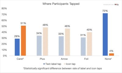
More importantly, usability experts strongly advise against the implementation of split buttons within accordion patterns. In a split-menu configuration, the text label is programmed to link directly to a separate page, while the adjacent icon is assigned the distinct task of opening the accordion. Usability testing consistently shows that this split pattern is harmful and confusing. Users rarely parse the subtle visual distinction between the text and the icon while scanning a menu, leading to frequent misclicks, unexpected page loads, and general user frustration.
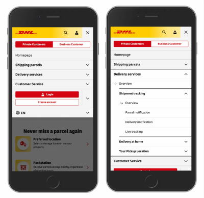
A much more reliable architecture involves allowing users to tap anywhere on the main category container to expose the nested menu options. To provide access to the top-level category page itself, designers can simply include a dedicated link, such as an "Overview" page, directly inside the expanded dropdown menu. Real-world implementations by major organizations, such as the logistics and shipping giant DHL, demonstrate the success of this pattern, utilizing clean accordion navigation devoid of unnecessary arrows or split-menu traps.

The Overloaded Meaning of Plus-Minus Signs and Arrows
Beyond carets, interface designers frequently turn to plus and minus signs, or directional arrows pointing up and down, to communicate expanded and collapsed states. While these symbols are generally understood by most users, they carry significant baggage due to their versatility.
The plus sign, for instance, is heavily overloaded across digital platforms. Depending on the context, a plus symbol can mean saving an item for later, adding a product to a shopping cart, zooming in on an image, or expanding a section. This ambiguity becomes particularly problematic in complex, multi-level navigation trees where multiple tiers might be open simultaneously.
Similarly, vertical arrows can be misinterpreted as indicators for scrolling, sliding, finding the next search match, or jumping to a specific portion of a long page. While plus-minus signs and arrows do work well in many contexts, their heavy semantic overloading makes them more prone to user misinterpretation than purpose-built indicators.
The Safest Choice for Modern Interfaces
Synthesizing these findings, usability researchers point to the downward-pointing caret or triangle as the safest default choice for collapsible accordions. Upon interaction, this icon can smoothly transition to point upward or sideways, providing clear visual feedback about the current state of the component. If designers require an alternative, standard plus and minus signs generally perform well, provided the context minimizes semantic confusion.
Ultimately, interface design thrives on simplicity. Modern web applications do not require an array of decorative arrows to guide users toward their destination. Avoiding split menus eliminates a primary source of user error, ensuring that a single interface element performs one predictable action—revealing hidden options or allowing users to drill down further. When direct navigation is required, underlining the title text provides an unambiguous signal that aligns with established user habits. As user experience research continues to demonstrate, simpler approaches almost always yield superior usability.