










Despite achieving broad browser support and standing at the top of developer wishlists for years, CSS container queries remain surprisingly underused and frequently misunderstood. Recent industry data shows a stark disconnect between awareness and actual adoption, prompting renewed discussions within the front-end development community about how these modern tools differ from traditional media queries and why developers continue to rely on outdated layout paradigms.
When CSS container queries first arrived in the modern web ecosystem, many developers shared a common initial skepticism. Knowing what is understood today, it is easy to look back with hindsight, but the initial reaction among many engineers was a simple question: why would container queries be necessary when media queries already handle responsive design? This confusion, it turns out, was shared by legions of web developers worldwide who viewed the new syntax as an unnecessary alternative to established methods.
Industry surveys highlight the scale of this adoption gap. According to the State of CSS data, approximately 86% of developers are aware of container queries, yet only about 41.4% actively use them in production projects. While developer surveys can sometimes carry inherent biases, this particular metric serves as a reliable indicator of the current landscape. During his presentation at SmashingConf Amsterdam, front-end educator Kevin Powell emphasized that container adoption has been remarkably slow. This reluctance is particularly striking given that the ability for individual components to adapt dynamically to the size of their outer container has historically dominated developer wishlists for years.

The core issue is not necessarily how developers are attempting to use container queries, but rather that many are approaching them with the wrong mental model. The fundamental reason for this misuse is simple: at first glance, container queries look almost identical to traditional media queries. Because the syntax appears familiar, it is easy to assume they serve the exact same purpose and operate under the same principles. They do not.

To understand the distinction, it helps to examine what standard media queries actually accomplish. For years, the viewport has acted as a proxy in web design. Media queries gave developers the illusion that screen width alone dictates how responsive applications should adapt to their surrounding environment. When writing a standard media query, a developer is essentially asking the browser a single question about the current width of the screen.
While media queries answer that viewport question reliably, they fail when a component is placed into a constrained context. For instance, if a card component is placed inside a grid cell that measures a mere 300 pixels wide on a large desktop monitor spanning 1920 pixels, a media query tied to the overall screen width will still trigger desktop styles. Because the viewport remains wide, the media query fires and applies large-scale rules to a component that has very little actual room to breathe, causing elements to deform, overflow, or cramp up. As Kevin Powell noted, media queries are not conceptually flawed, but they are functionally limited because they lack contextual awareness about what is happening inside the page structure.
Container queries operate by looking inward rather than outward. Instead of asking how wide the browser window is, a container query asks how much space is available in a specific spot at that exact moment. By registering a parent wrapper as a container, components can adjust their layouts based entirely on their immediate surroundings rather than the dimensions of the user’s screen. If the container has enough horizontal space, the component can expand into a row layout; otherwise, it falls back to a stacked arrangement.
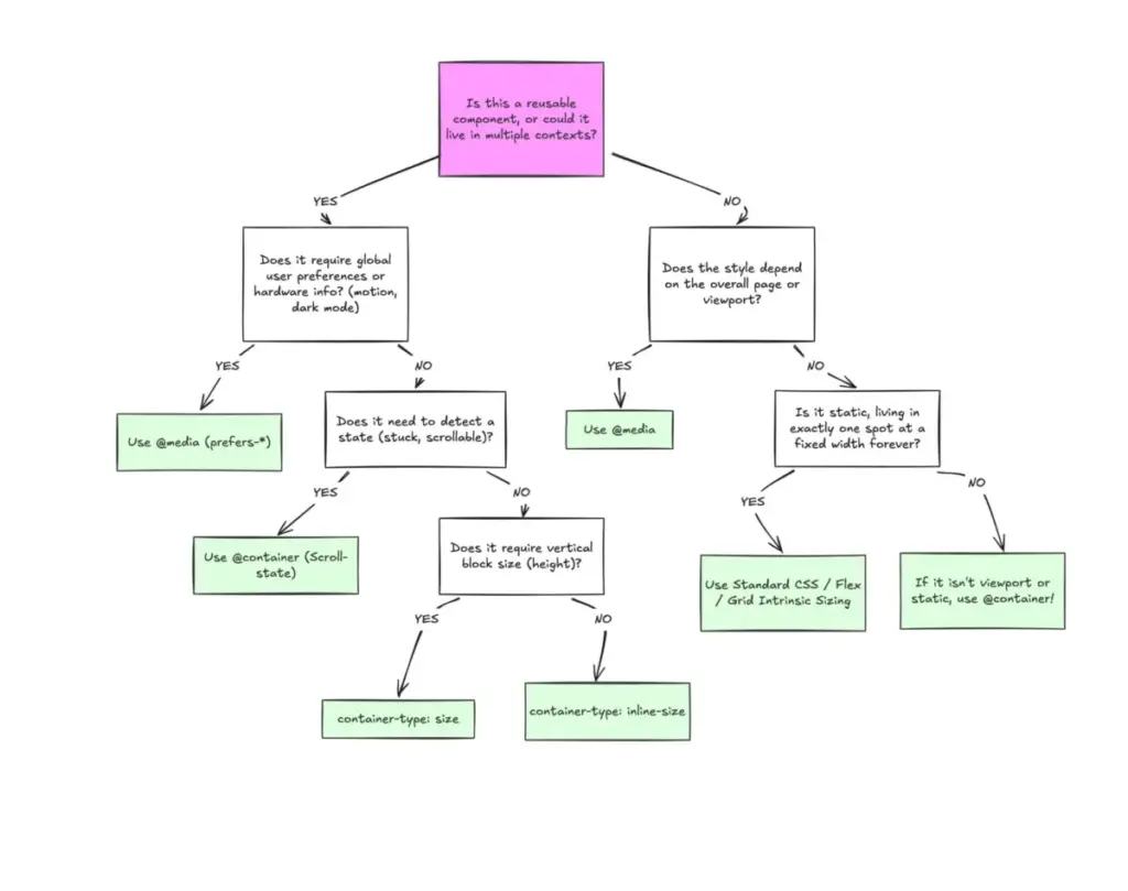
This dichotomy highlights a broader conceptual difference between macro layouts and micro layouts. Media queries are ideally suited for macro layouts, handling major structural decisions that affect the entire page, such as page-level grids, headers, footers, system color preferences, and device capabilities like touch screens. Container queries, conversely, are designed for micro layouts—the various components that live inside that macro structure, such as cards, widgets, forms, and navigation modules.

In the modern web ecosystem, where over 2,300 unique viewport sizes exist across various devices, anticipating every possible screen dimension is nearly impossible. Shifting layout logic closer to the container relies on the content itself to determine the presentation, rather than forcing an abstract viewport threshold to dictate how a component should look.
This principle extends beyond structural layouts into other areas, such as typography. Developers have long relied on viewport-relative units within media queries to create fluid typography that scales with the screen size. However, when those components are moved into restrictive contexts like sidebars, viewport-relative scaling can cause typography to become disproportionately large or small. Container queries introduce dedicated units that, when paired with modern CSS functions like clamp, allow fluid typography to scale relative to the component’s container rather than the browser window, keeping the entire presentation self-contained.
Similarly, container queries offer sophisticated ways to handle internal component states, such as flexbox wrapping. Traditional media queries are structurally blind to internal layout events, such as when flex items wrap onto a new line, because they only observe the outer browser window. By nesting container queries inside flex items, developers can create reliable workarounds that detect when wrapping occurs and adjust styles accordingly without needing JavaScript-based observers.
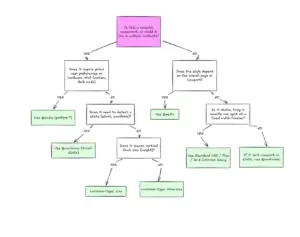
Despite their power, container queries come with specific side effects and technical caveats that developers must navigate. Because a container cannot query its own dimensions without creating an infinite loop, developers must establish a clear parent-child wrapper relationship in the Document Object Model. Furthermore, querying a container’s block size or vertical dimensions without explicit height constraints can cause layouts to collapse, making inline-size queries the preferred default for most use cases. Additionally, container queries cannot currently accept CSS custom properties directly in their conditions, as variables cascade down the DOM tree and could introduce complex dependency loops.

Ultimately, the hesitation surrounding container queries stems from familiarity with media queries, which have anchored responsive design for over a decade. Rather than entirely replacing media queries, container queries fill the gaps left by viewport-centric design. By understanding the distinction between macro page structures and micro component contexts, developers can deploy the right tool for the job, ensuring that reusable components adapt naturally to whatever environment they inhabit.