










Mental health applications are facing a severe, ongoing engagement crisis. Industry data highlights a stark reality: nearly 95% of users who open a mental health application on day one abandon it by day thirty, with the median 30-day retention hovering at a meager 3.3%. Even the most recognized and established giants in the mental health space lose approximately 50% of their user base within the first ten days. This profound collapse in retention underscores why interface design must be treated as a critical clinical and operational priority rather than a mere aesthetic choice.

According to designer Kat Homan, many contemporary user interface (UI) trends are fundamentally optimized for capturing attention and signaling product innovation. However, these goals directly conflict with the unique needs of mental health applications, which require reducing cognitive strain, fostering deep trust, and providing a genuine sense of refuge. When developers chase visual fashion in a space defined by user vulnerability and cognitive strain, they risk adding friction precisely when users have the least mental energy to spare, quietly eroding the utility and trust upon which these platforms depend.

Users rarely open mental health apps out of casual curiosity. Instead, they turn to these digital tools out of acute need, often while experiencing stress, anxiety, overwhelm, or exhaustion. In these vulnerable states, an unconventional icon, a confusing gesture, or a flashy, unnecessary animation transforms from a delightful surprise into an extra layer of cognitive overload. Research indicates that complex, trend-driven interfaces increase the time and effort required to engage, creating a digital obstacle course that undermines healthy habit formation.


This friction becomes particularly damaging during moments of acute crisis. Studies suggest that individuals experiencing high anxiety or depression find even typing or making simple choices overwhelming. When an interface demands excessive cognitive effort at the exact moment support is needed, it gives an overburdened user a compelling reason to close the app and never reopen it. Conversely, applications featuring simple, streamlined interfaces reduce the time and effort required to engage, directly supporting user retention.

This does not imply that every mental health product must look visually plain or entirely minimal. Instead, the central question is whether the interface meets the user’s current capacity. For instance, a panic-support tool functions best when it offers a small number of obvious, direct actions rather than forcing the user to browse a dense library. If a calming action meant for a moment of panic suddenly triggers an unexpected paywall or upgrade screen, the product fails the user at the most critical juncture.

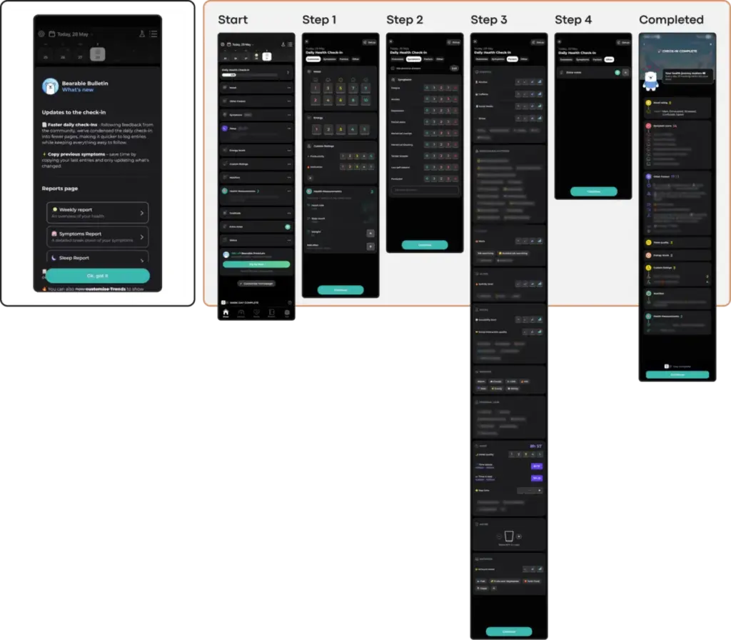
To address these challenges, designers must evaluate whether a visual or interaction pattern lowers the cost of using the app when the user can least afford it. This principle has guided the development of several newer wellbeing applications aiming to reduce cognitive friction. For example, some stress-reduction and parenting support tools have integrated voice-input paths alongside text alternatives, allowing overwhelmed users to share what is on their mind without the mechanical burden of typing. Similarly, specialized quick-relief flows permit users to vent and regulate their negative emotions before guiding them into more reflective exercises.

The emotional tone of an app must also align with the user’s psychological state. Investigations into how color and aesthetics influence mood in mobile health apps reveal that users in distress show a strong preference for subtlety. They often gravitate toward dark palettes, sophisticated looks, and clean, uncluttered aesthetics, noting that cheerful, bright colors can create a jarring and physically uncomfortable conflict with their current mood.

While the mental health category is broad—encompassing self-care, anxiety support, habit change, trauma tools, and therapy-adjacent products—an overly cheerful, bold, or trend-forward interface can easily feel dismissive to someone in distress. Trust is built when an interface respectfully aligns with the user’s emotional reality, offering solace through subtlety rather than solutions through visual saturation.

Furthermore, mental health relies heavily on routine and predictability, whereas many contemporary UI trends thrive on novelty and disruption. When an app introduces non-standard navigation patterns, unique swipes, or unusual button behaviors, it forces the user to learn a new mechanic before they can take action. While a gamified approach may work well when a user is exploring and ready to build habits, open the same app after a hard day just to complete a simple task, and non-skippable celebration screens can become an annoying barrier.

Accessibility represents another critical frontier where trends often fall short. Popular minimalism often relies on low-contrast text that fails users with visual impairments, while gesture-only navigation marginalizes those with motor difficulties. Given that the population needing mental health support disproportionately includes individuals with these accessibility needs, choosing a trending aesthetic over an accessible design actively limits the application’s reach and efficacy.

Finally, the uncritical adoption of aggressive engagement mechanics—such as continuous streaks, urgent notifications, and high-pressure gamification systems—can backfire in a mental health context. While these features are designed to maximize screen time in entertainment or productivity apps, they can easily transform into a source of performance pressure and guilt when applied to recovery and well-being. For a user managing depression, a broken streak or a missed daily goal can exacerbate the very feelings of failure the application aims to alleviate.

Addressing these systemic design flaws is an urgent necessity. The World Health Organization estimates that approximately one billion people globally live with a mental disorder, with depression and anxiety cases having risen significantly over the past decade. As the digital health sector continues to evolve, developers must adopt a radically contextual approach to UI design, ensuring that their tools serve as quiet, trustworthy helpers that prioritize emotional support over fleeting visual trends.