







User experience design often comes down to micro-decisions that, while seemingly insignificant on the surface, carry profound implications for how users navigate digital products. Among these subtle UI elements, the humble accordion menu remains a staple of modern web and mobile architecture. Yet, despite its ubiquity, designers have long wrestled with a fundamental question: What icon is the most reliable to signal the expansion and collapsing of content sections? Is there really any noticeable, measurable difference between carets, chevrons, arrows, and triangles?
Recent findings from the Nielsen Norman Group (NN/g) shed new light on this debate, offering empirical clarity on how users interpret these symbols. Beyond simply identifying the best-performing icon, the research dives into deeper architectural pitfalls, demonstrating why split menus are fundamentally harmful, why separating the actions of an icon and its accompanying text label creates friction, and why the caret emerges as the safest, most dependable choice for interface designers worldwide.
Decoding User Expectations: The Problem with No Icons and Custom Graphics
When evaluating accordion usability, researchers examined how users react to various visual cues—or the complete lack thereof. The findings regarding unadorned menu items are hardly surprising, yet they underscore a vital rule of digital wayfinding: without any accompanying icon, users universally expect that tapping or clicking on a menu item will transport them directly to a brand-new page.

The friction multiplies when designers introduce custom, highly stylized icons. Because these bespoke graphics rarely adhere to established mental models, they fail to clearly signal that interacting with them will trigger an accordion dropdown. Furthermore, eye-tracking and interaction studies reveal that users tend to distribute their clicks fairly equally between the icon and the text label for most standard symbols. This user behavior means that an icon choice does not merely serve as a decorative or supplementary visual signal; it dictates the entire hit area of the interactive component.

Many digital products attempt to overcomplicate this dynamic by dynamically altering interface graphics—displaying arrows and carets pointing in various directions depending on whether a section is expanded or collapsed. However, interface research suggests that designers rarely need to employ complex directional arrows simply to indicate a link to a parent category.
Instead, the industry standard for plain text navigation remains remarkably straightforward: if a label is intended to function as a hyperlink taking the user to a dedicated page, the most effective and universally understood method is to simply underline it. While an underline may lack aesthetic novelty, it functions flawlessly across demographics and use cases, eliminating any ambiguity about where a click will lead.
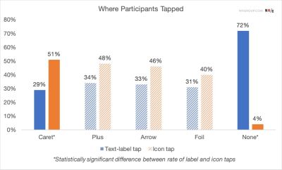
The Pitfalls of Arrows and Split Buttons in Navigation
Navigating digital menus often becomes unnecessarily convoluted when interfaces incorporate right-facing arrows alongside downward-pointing counterparts. Research indicates that a right-facing arrow does not reliably trigger an expectation of navigating directly to a new page, nor does a downward-facing arrow automatically communicate that an accordion menu will deploy upon impact.
This ambiguity often tempts design teams to implement split buttons for accordions—an interaction pattern where the text label links directly to a destination page, while the adjacent icon is assigned the distinct task of opening or closing the accordion menu. According to usability testing, this split approach is consistently harmful. It routinely results in user error, frustration, and misclicks, as users struggle to distinguish between the dual functional zones of a single menu item.

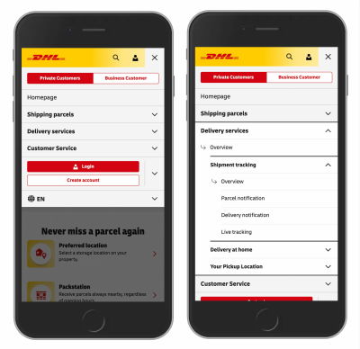
A far more reliable architectural pattern involves allowing users to tap anywhere on the main category container to expose the nested sub-options, while relegating the direct link to the category page to a dedicated entry point inside the newly revealed menu. Major enterprise platforms, such as international shipping leader DHL, successfully employ this streamlined methodology in their e-commerce and logistics interfaces. By discarding unnecessary directional arrows and eliminating split menus, these designs provide clear "Overview" links inside each section, aligning perfectly with how users naturally process hierarchical information.
The Overloaded Meaning of Plus-Minus Symbols and Arrows
Beyond carets and chevrons, interface designers frequently rely on plus and minus signs, or vertical and horizontal arrows, to communicate expanded and collapsed states. While these symbols are generally understood by the average web user, they carry significant baggage stemming from their heavy semantic overload.
The plus sign, for instance, is subjected to a wide variety of interpretations across different digital contexts. Depending on the application, a plus icon might signify saving an item for later, adding a product to a shopping cart, zooming into an image, or expanding a section. This ambiguity becomes particularly acute in multi-level navigation structures where multiple tiers of menus are left open simultaneously, leaving users disoriented about the scope of the interaction.
Similarly, standard arrows can signify scrolling behavior, sliding animations, the search for the next matching keyword, or a sudden jump to a specific anchor point within a long-form document. While plus-minus symbols and directional arrows are certainly functional and deeply ingrained in digital culture, their vulnerability to misinterpretation makes them secondary choices compared to more precise signifiers.
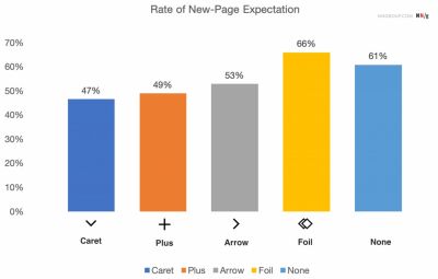
Establishing Best Practices for Modern Interface Design
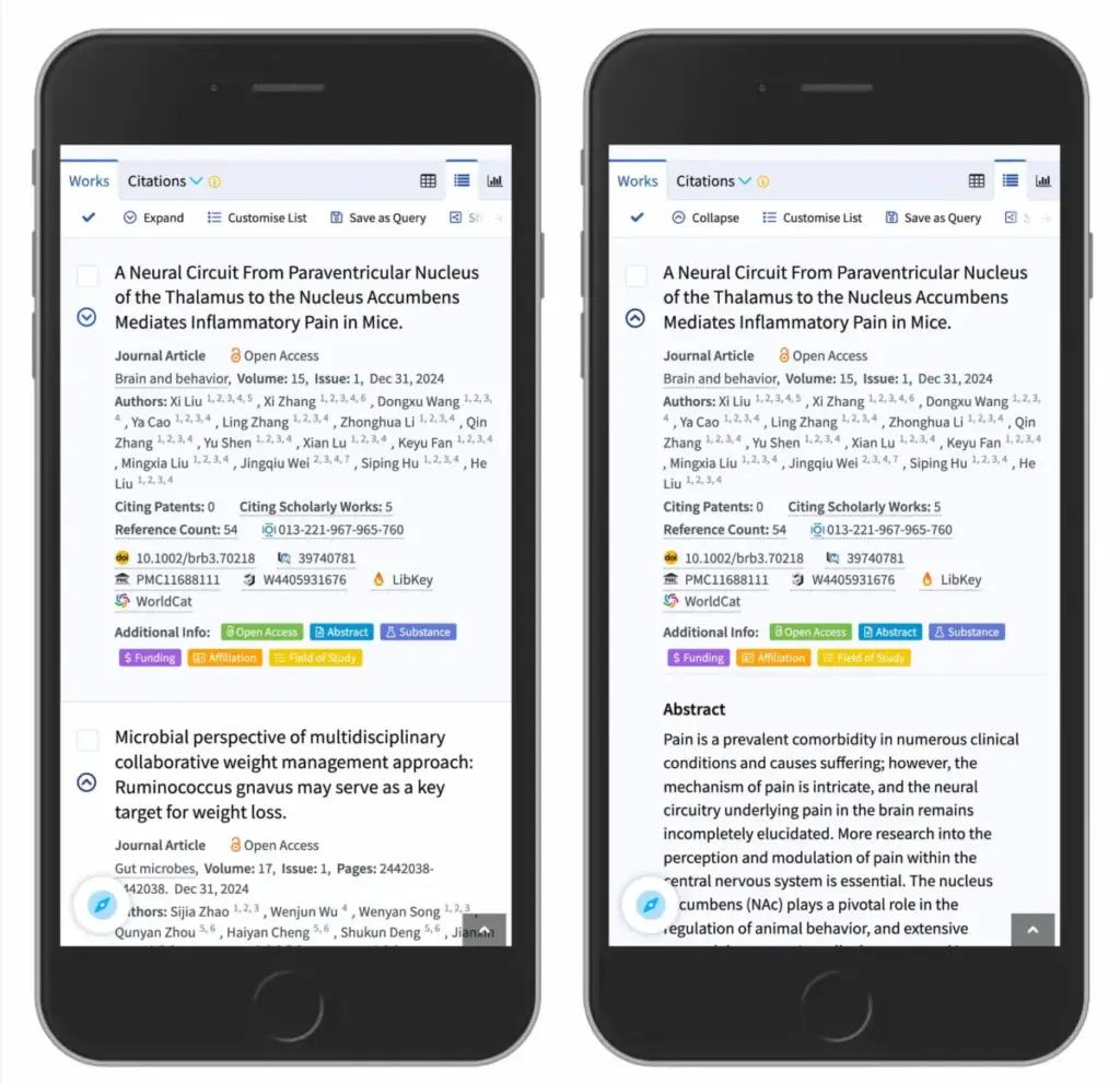
Synthesizing the empirical data, the safest and most reliable choice for interface designers is to utilize a standard downward-pointing caret or triangle by default. Upon user interaction, this icon should seamlessly transition to point upward or sideways to reflect the updated state of the container. When an alternative is required due to specific design constraints, traditional plus and minus symbols generally perform well, provided they are contextualized properly within the interface.
Ultimately, the research reinforces a timeless maxim in digital product design: simpler is almost always better. Complex navigational schemes do not require auxiliary arrows to dictate where links lead, and split menus routinely generate more user errors than they prevent. By opting for a single cohesive control that executes a unified action—exposing available options and allowing users to drill down deliberately—designers can drastically reduce cognitive load. When a direct pathway to a separate page is required, formatting the title as an underlined hyperlink remains the gold standard of web usability.