












Data visualization sits at the critical intersection of two organizational disciplines that historically rarely talk to each other: data science and design. Across modern businesses, software tools have made data more accessible than ever, resulting in performance decks and dashboards tailored for nearly every function—from sales and marketing to product and operations. Yet, in weekly standups and quarterly reviews across industries, a familiar scene plays out repeatedly: teams review a flurry of numbers, the room nods in agreement, and the meeting concludes without a definitive decision or a clear operational direction.
When this happens, the blame is routinely placed on the data itself. Teams claim the numbers were not granular enough, datasets were incomplete, or that further information is required before any concrete action can be taken. In reality, however, the data is rarely the root of the problem. The underlying issue is that the visualization was never truly designed to deliver actionable insights. Charts are frequently built using whatever metrics happen to be readily available, rather than being shaped around the specific questions that actually need answering. Audiences are assumed rather than thoroughly understood, and the fundamental question of what should actually change as a result of viewing the data is often entirely overlooked.
Data visualization and user experience (UX) design are ultimately solving the exact same underlying problem: both disciplines strive to move the right information to the right person in a manner that triggers a meaningful change. While their vocabularies differ, their core challenge is identical. The moment organizations begin treating them as complementary disciplines is the precise moment dashboards transition from being passive collections of charts into functional, decision-making engines.


The Chart Was Never the Whole Story
The historical precedent for the communicative power of visualization dates back decades. In 1973, statistician Francis Anscombe published a landmark paper illustrating a vital point about data analysis. He constructed four distinct datasets that shared identical statistical properties: they possessed the same mean, the same variance, the same correlation coefficient, and the exact same regression line. When subjected to mathematical calculations, they appeared completely identical. Yet, when plotted visually, they could not have been more different.
Anscombe’s quartet demonstrated to statisticians that visualization reveals the operational truth that raw numbers often conceal. However, visualization serves a dual purpose; beyond its diagnostic utility, it is deeply communicative. The visual form chosen dictates whether true understanding emerges or gets completely lost in the surrounding noise. When audiences review data, the goal is not merely for them to walk away with numbers, but with a compelling story they can comprehend, quote, and act upon.
A prime modern illustration of this principle is Visual Capitalist’s historical timeline of pandemics. Instead of burying readers in an exhaustive data table containing millions of casualty counts, the project maps the death tolls of major historical outbreaks using a proportional bubble layout along a single, continuous timeline. Before the human brain even processes a single numerical label, the visual system instantly grasps the staggering scale of the Black Death relative to every other historical event displayed on the page. The right visualization does more than simply plot points; it makes the underlying narrative impossible to miss.

In the realm of design theory, Edward Tufte long ago codified a foundational principle known as the data-ink ratio, which posits that every single mark on a chart should serve the data rather than decorating it. While this framework remains widely utilized in data visualization under the assumption that visual hygiene and clarity are paramount, it presents limitations in practical organizational contexts. A chart is rarely read in absolute isolation; rather, it is consumed by a real person operating within a specific context and under distinct professional pressures. Stripping a chart down to its absolute cleanest form can inadvertently strip away the exact layer of contextual nuance that a decision-maker requires. Ultimate simplicity is rarely the true goal; rather, the objective must be appropriate complexity. Data functions as a message, and the appropriate amount of signal depends entirely on the specific recipient.
The Critical Phase Before the Chart
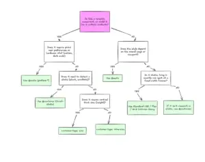
Industry experts note that roughly 80% of the work that determines whether a dashboard succeeds actually happens long before a single chart is ever drawn on a screen. This high-leverage preparation takes place upstream, unfolding before tools are opened, datasets are queried, or design choices are finalized. It relies on addressing core questions regarding context, audience, and intended insights.
Most data-heavy projects unfortunately begin backward. Teams frequently pull whatever metrics their internal analytics tools happen to track automatically and build visualizations around them, leaving the actual question the data was supposed to answer completely unasked. This habit stems from anchoring on the readily available data as the absolute boundary of what is possible. Defining a goal first sounds intuitive, but in practice, it rarely happens with the requisite clarity. Broad requests to show product performance lack the necessary metrics, defined populations, and implied actions found in targeted goals, such as identifying which specific features drive retention among users who signed up during a specific quarter.

This distinction dictates everything that follows, including what is included, what comparisons matter, and what is left out entirely. Starting with available data produces a dashboard that answers no particular question because it was never engineered to do so, leaving every number present but pointing nowhere. Conversely, starting with an operational question ensures that every element on the screen earns its place by contributing directly to an answer.
Audience analysis is similarly vital, resting fundamentally on two pillars: familiarity and accountability. Familiarity relates directly to data literacy. Determining whether an audience reads charts instinctively or struggles with complex visualizations prevents unnecessary friction. Handing a dense, multi-layered dashboard to a busy executive and a senior data analyst simultaneously is akin to handing the exact same map to someone who navigates by physical landmarks and someone who reads precise grid coordinates. While the data remains accurate, it is only functional for one of the recipients.
Accountability, meanwhile, dictates how that inherent complexity must be presented. A chart indicating a significant performance decline carries vastly different professional weight for the executive directly responsible for that metric compared to an analyst tasked merely with reporting it. Understanding these dynamics establishes how much information can be safely placed in front of an individual without causing cognitive overload. Consequently, density becomes a variable tool; analysts require high-density environments for diagnostic discovery, while executives typically require highly synthesized overviews optimized for rapid strategic and financial decisions.

Transforming Information Into Insight
A prevalent misconception in data projects is the comfortable assumption that if a chart is accurate and clear, the resulting insight will naturally take care of itself. In reality, information and insight represent entirely separate states. Information is simply what the data displays, whereas insight is the specific decision, paradigm shift, or course correction triggered by viewing it. If the intended business outcome is not clearly defined before the design process begins, dashboards inevitably default to passive reporting rather than active direction.
When core business metrics fluctuate unexpectedly, marketing and engineering teams frequently feel the negative impacts of this gap. A dashboard built strictly for information sounds a simple alarm, plotting a sharp drop in a metric like booking rates. Lacking depth, leadership often panics and initiates costly, misplaced fire drills, incorrectly assuming technical failures in the user interface. Conversely, a dashboard built for insight isolates the necessary variables to inform a precise decision, mapping drops against traffic sources and campaign launches to reveal whether performance is stable and anomalies are merely the result of low-intent traffic influxes.
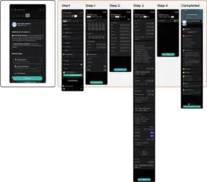
A real-world illustration of this user-centric approach occurred during a project for an enterprise B2B SaaS platform focused on talent management and competency tracking. The platform captured massive telemetry data, and the initial brief was characteristically open-ended: the company possessed an immense archive of user activity and needed to present it effectively to enterprise clients. Rather than falling into the trap of charting every available data point and creating a confusing data graveyard, the development team focused on architecting a practical tool for real people who needed honest, immediate insights into their daily workflows.

Translating broad ambitions into tangible visualisations required defining the true mechanics of professional performance. Standard metrics like time spent on a platform are easy to track and display, but they merely indicate presence rather than actual value gained. More meaningful signals—such as specific competency scores, certification completion rates, and historical performance trajectories—provided a much richer context when paired with time-spent data, ultimately highlighting underutilized modules and skill gaps.
Furthermore, addressing audience needs meant rejecting the lazy shortcut of using identical charts with altered scales for different user tiers. Instead, the team designed distinct experiences. Frontline individual contributors received a self-directed personal workspace acting as an honest mirror for tracking pacing and skill gaps, while managers received an aggregate pulse-check view designed to highlight team vulnerabilities and foster proactive coaching before minor issues escalated into critical project failures.
By shifting the focus from passive information logs to active decision-making tools, the project demonstrated the tangible value of integrating structured UX thinking into data visualization. Engagement metrics rose as teams began utilizing the dashboards for weekly planning rather than retrospective post-mortems, and platform churn dropped to record lows. Ultimately, treating visualization as an upstream architectural choice ensures that data stops serving as a passive historical record and begins successfully guiding future business direction.