









Despite achieving robust, cross-browser support that now sits at roughly 94 percent worldwide, CSS container queries remain surprisingly underused and frequently misunderstood across the web development industry. While traditional media queries have long served as the backbone of responsive design, they dictate layout adjustments based entirely on the external viewport. Container queries, by contrast, allow individual components to respond naturally to the specific contexts and spatial constraints in which they actually appear. Yet, years after their introduction to modern browsers, developers continue to struggle with their adoption, often treating them as mere replacements for media queries rather than recognizing the paradigm shift they represent.
The hesitation surrounding container queries is well-documented in industry metrics. According to data from the State of CSS survey, while roughly 86 percent of developers are aware of container queries, only 41.4 percent actively use them in production environments. During a presentation at SmashingConf Amsterdam, industry expert Kevin Powell pointedly noted that the adoption rate for container queries has been remarkably poor. This lag in industry uptake is particularly striking given that the ability for modular components to adapt fluidly to the size of their outer containers sat at the very top of developer wishlists for years.
To understand why adoption has stalled, one must look at how the feature is perceived. To be completely honest, many developers missed the initial announcements when container queries first shipped, and the immediate reaction upon discovering them was often skepticism: why introduce a new mechanism when media queries already handle screen responsiveness? This confusion stems largely from visual familiarity. At first glance, container queries look almost identical to media queries. Because they share a similar syntax, it is easy to assume they serve the same purposes and operate under the same fundamental assumptions. They do not.

To use container queries correctly, developers must first understand the fundamental limitation of traditional media queries. The viewport has always been a proxy—a convenient tool that gave the web industry the illusion that total screen width alone dictates how a responsive application should adapt to its environment. When a developer writes a media query checking for a minimum width of 1024 pixels, they are asking the browser a single question: How wide is the screen right now?
Media queries answer that question reliably, but they are entirely blind to internal layout realities. Consider what happens when a card component utilizing a media query for a wide layout is placed inside a grid cell that is only 300 pixels wide on a massive 1920-pixel desktop monitor. The media query does its job based on the viewport, firing the wide-screen styles because the browser window exceeds the threshold, even though the card itself has been squeezed into a tight space. The result is a deformed, cramped, or overflowing component. As Kevin Powell aptly observed, media queries are not conceptually flawed, but they are fundamentally limited because they simply do not know very much about the actual elements populating the page.
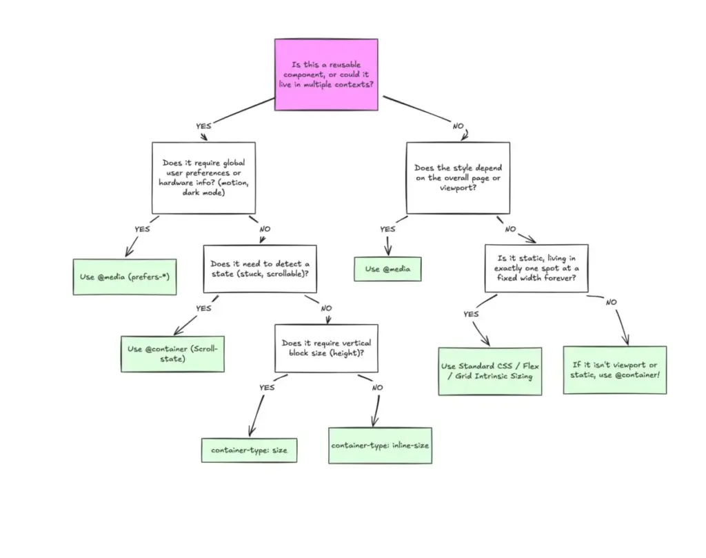
Container queries solve this by looking inward rather than outward. Instead of asking how much space the entire device offers, a container query asks how much space is available for a specific component in its current location, right now. By registering an element as a container using properties like container-type: inline-size, developers allow components to react strictly to the dimensions of their immediate parent wrappers. If a wrapper provides enough horizontal space, the component adapts accordingly; if the wrapper is narrow, the component falls back to its default layout, regardless of whether the user is browsing on a high-end desktop monitor or a mobile smartphone.
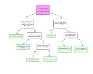
This distinction highlights a broader division in modern web architecture: the separation between macro layouts and micro layouts. Media queries remain ideal for macro layouts—the structural framework of the page, such as major grid systems, persistent headers, window-spanning footers, system-level user preferences like color schemes, and hardware capabilities like touch screens. These elements are genuinely tied to the global page structure and the viewport. Container queries, meanwhile, are engineered for micro layouts—the self-contained components that live inside that macro structure, such as cards, interactive widgets, complex forms, and localized navigation modules.
With over 2,300 unique viewport sizes currently tracked across the modern web ecosystem, attempting to account for every edge case using abstract pixel thresholds on the viewport level has become increasingly untenable. Layout logic is inherently closer to the container than the viewport in an era defined by component reuse and modular design. Relying on content and container boundaries to determine layout, rather than arbitrary screen dimensions, aligns development practices with how modern applications are actually built.

This shift in perspective extends beyond structural layout into areas like typography. Historically, developers relied heavily on media queries paired with viewport-relative units like vw or vh to scale typography across different screen sizes. While effective at the page level, this technique causes problems when a component is relocated to a confined space like a sidebar, where the global viewport width is entirely irrelevant. Scaled typography can suddenly become disproportionately large or illegible because it was anchored to the wrong reference point.
Container queries introduce their own dedicated relative units, such as cqi and cqw, which can be combined with CSS functions like clamp() to achieve truly fluid typography. By coupling these units directly to the component container rather than the browser window, typography scales naturally with the space allocated to that specific element, ensuring that a card title looks correct whether it appears in a full-width hero section or a narrow dashboard panel.
Furthermore, container queries offer sophisticated ways to handle internal layout states that media queries cannot touch. Flexbox layout, for instance, is exceptional at wrapping content automatically when space runs out, but CSS has traditionally lacked a way to detect when a wrap event occurs without resorting to JavaScript observers. Because media queries only observe the external browser window, they are structurally blind to internal layout events. By nesting container queries inside flex items, however, developers can create clever workarounds where an item expands to fill available space, triggering the container query as soon as the component crosses a specific size threshold. This enables components to alter their internal arrangement dynamically as they wrap into new rows, bridging a long-standing gap in native styling capabilities.
Despite their power, container queries come with specific side effects and technical caveats that require careful handling. Chief among these is the structural relationship required between elements. A container cannot query itself; attempting to declare a container and immediately query its own size for styling adjustments creates a logical infinite loop. Consequently, developers must often introduce an explicit parent wrapper to serve as the designated container, shifting styles onto descendant elements based on that parent’s dimensions.

Querying a container’s full size can also introduce layout collapse if not managed properly. When developers target a container’s block or vertical size rather than its inline size, the browser calculates dimensions without factoring in the content inside, potentially collapsing the element to zero height unless explicit dimensions or aspect ratios are provided. Additionally, container queries currently cannot accept CSS custom properties as threshold values, as variables cascade down the DOM and could introduce circular dependency conflicts during style calculation.
Ultimately, container queries are not intended to replace media queries wholesale, nor should developers abandon traditional techniques entirely. The two systems serve complementary roles defined by context and scale. Media queries remain the right choice for global, page-level structural shifts tied directly to the browser viewport. Container queries shine when designing reusable, modular components that must adapt gracefully to multiple layout contexts across an application. By understanding the distinct responsibilities of macro and micro layouts, developers can leverage container queries to build more resilient, truly responsive interfaces.