









Despite broad browser support approaching nearly 94 percent across the modern web, CSS container queries remain surprisingly underused and frequently misunderstood by developers. Years after their initial release and subsequent integration into the baseline of modern browser features, the web development community continues to struggle with a fundamental paradigm shift: moving away from viewing responsive design strictly through the narrow lens of the device viewport and toward a component-driven architecture.
Data from the 2025 State of CSS survey reveals a striking paradox in contemporary frontend development. While approximately 86 percent of surveyed developers report an awareness of container queries, only about 41.4 percent actively use them in production environments. This lag in adoption was highlighted during industry events like SmashingConf Amsterdam, where web experts pointed out that container query adoption has been remarkably sluggish. This hesitation is particularly ironic given that the ability for modular components to autonomously adapt to the size of their parent container sat at the absolute top of developer wishlists for years.
The root cause of this underutilization often stems from a simple optical illusion. At first glance, container queries look almost identical to traditional media queries. Because they share a remarkably similar syntax, it is easy for developers to assume that they serve identical purposes and function under the same mechanical principles.

In reality, they do not. The historical reliance on media queries created an industry-wide illusion that screen width alone is the primary driving force behind how responsive applications adapt to their operating environments. When a developer writes a media query asking the browser about the current screen dimensions, the query simply evaluates the outer viewport. It remains completely blind to the micro-environment where a specific component actually lives.
Consider a common scenario involving a card component. When a developer sets a media query to apply a horizontal flex layout when the viewport exceeds a certain width, the browser evaluates the global screen size. If that card component is subsequently placed inside a constrained grid cell or a narrow sidebar on a massive desktop display, the global viewport is still exceptionally wide. Consequently, the media query fires, forcing the card into a horizontal arrangement despite having only a fraction of the horizontal space required. The result is inevitably a deformed, cramped, or overflowing user interface.
Container queries fundamentally change this dynamic by looking inward rather than outward. Instead of asking how wide the global screen is, a container query asks how much space is available inside a specific, localized context right now. By registering an element as a container using properties like container-type: inline-size, components become entirely self-reliant. They no longer care whether they are being viewed on a high-end desktop monitor, a smartphone, or embedded deep within a cramped dashboard widget. They simply respond to the dimensional realities of their immediate wrapper.
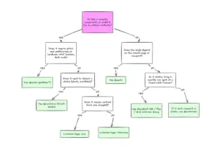
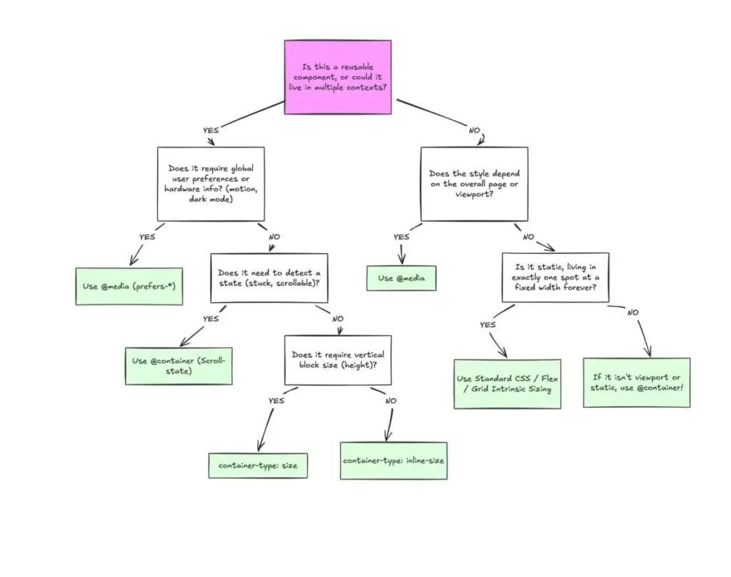
This distinction highlights a broader conceptual split between macro layouts and micro layouts within modern web architecture. Media queries remain exceptionally well-suited for macro layouts—the structural elements that define an entire page, such as global headers, footers, primary grid systems, operating system color scheme preferences, and device capabilities like touch screens. These macro elements are genuinely tied to the global page structure and the browser window.
Container queries, by contrast, are engineered for micro layouts. These are the components that populate the interior of the macro structure, including cards, widgets, forms, and localized navigation bars. An individual UI component should not magically transform into a tablet-sized layout simply because the overall window width crosses an arbitrary threshold. Instead, it should alter its internal structure the exact moment it is granted enough physical room to do so, regardless of whether that environment happens to be a mobile viewport or a narrow desktop sidebar.

This shift in perspective becomes even more critical when considering the fragmentation of modern hardware. Industry data shows that developers now have to account for more than 2,300 unique viewport sizes across the web ecosystem. Relying solely on global screen widths to manage component responsiveness is an uphill battle. When layout logic is moved closer to the container rather than the viewport, the application relies on the content itself to dictate its visual structure.
This component-centric approach extends beyond simple structural changes into areas like typography and internal layout tracking. Traditionally, developers have relied on viewport-relative units combined with fluid typography techniques to scale text sizes based on the global screen dimensions. While effective at the page level, this approach breaks down the moment a component is relocated to a constrained area like a sidebar, where the viewport dimensions are entirely irrelevant. Container queries introduce dedicated relative units that allow fluid typography to scale directly with the component’s container rather than the browser window, keeping the styling entirely self-contained.
Furthermore, container queries offer unique capabilities regarding internal layout states that media queries cannot replicate. Because media queries only observe the external browser window, they are structurally blind to internal layout shifts, such as when flexbox items automatically wrap onto a new line due to a lack of space. By nesting container queries inside flex items, developers can detect these internal state changes and adapt component styling dynamically without resorting to complex JavaScript solutions like resize observers.
Despite their power, container queries come with specific side effects and technical caveats that developers must navigate. Because a container cannot query its own dimensions without creating an infinite calculation loop, container queries require a distinct parent-child markup structure. An element cannot be declared as a container and simultaneously have its own direct styles altered by that exact same container query. An intermediary wrapper is typically required to establish the proper hierarchy.

Additionally, querying a container’s block size—its vertical dimension—without explicitly defining an explicit height, minimum height, or aspect ratio can cause the layout to collapse entirely to zero pixels, as the browser calculates dimensions independently of the children. For this reason, developers frequently rely on inline-size queries for horizontal space rather than full dimensional queries. Another limitation is that container queries cannot currently accept CSS custom properties as values, preventing developers from dynamically querying against variables that cascade down the DOM tree, due to the potential for recursive style loops.
Ultimately, container queries are not intended to completely replace traditional media queries. Both systems occupy vital, complementary roles in modern responsive web design. Media queries continue to govern global, page-level macro structures, while container queries handle the adaptive behavior of reusable, modular components. Understanding this clear separation of concerns allows developers to build more resilient, adaptable interfaces that gracefully handle the immense variety of contexts present across the modern web.