











When a corporate branding project ultimately falls short, the failure can rarely be traced back to the final logo design stage. Instead, the breakdown almost always occurs much earlier in the strategic lifecycle—specifically during the discovery phase, when abstract, high-level descriptors like "modern," "trustworthy," "premium," "friendly," and "disruptive" are left completely undefined. The resulting disconnect creates a chasm between what a brand is genuinely intended to communicate to its market and what a designer is ultimately expected to conjure up on a blank screen. This foundational space, which bridges corporate strategy and visual execution, is increasingly recognized by top-tier creative studios as the "pre-concept" phase.
At the very onset of a brand identity initiative, design teams are typically handed a standard assortment of inputs: a project brief, notes from a handful of stakeholder interviews, a collection of competitor references, and perhaps a generalized moodboard or a loose list of adjectives. From there, they are tasked with generating visual concepts that simply "feel right." However, judging whether a design is truly right becomes an exercise in frustration when the core project team has never genuinely agreed on what the brand needs to communicate in the first place.
To illustrate this systemic challenge, consider a health tech enterprise that recently sought a comprehensive brand overhaul. The executive stakeholders stated unequivocally that they wanted their new visual identity to look modern, trustworthy, and disruptive. Initially, the inclusion of the word "disruptive" suggested a push toward something bold, unconventional, and visually aggressive. Yet, as deeper conversations unfolded, a different reality emerged. For this specific company, true disruption still had to feel completely credible and safe inside a notoriously conservative healthcare environment. Because their primary clients were large government medical institutions, a brand identity that leaned too heavily into rebellious, experimental, or visually loud territories would actively undermine the precise kind of institutional trust they needed to secure. In short, their operational definition of "disruptive" looked far more traditional than the literal word implied.
The underlying problem was never that the client used incorrect language. The root issue was that the language itself was far too broad to effectively guide concrete design decisions. Before any creative professional can successfully translate a business strategy into a cohesive visual concept, those ubiquitous buzzwords must undergo a rigorous process of specification. What kind of modern are we talking about? Trustworthy in what specific context? Disruptive when compared to whom? And precisely how far can a brand deviate from established category expectations before it begins to alienate its target audience?
Navigating this critical transition requires meticulous attention to the pre-concept phase—the intensive work that takes place immediately after the project kickoff but strictly prior to the development of the first visual directions. While the broader brand identity lifecycle for modern digital products encompasses comprehensive strategy, concept formulation, asset generation, and the creation of design systems that product teams need to build consistently, the pre-concept phase focuses strictly on the foundational groundwork. This involves deeply researching the brand context, uncovering hidden assumptions shared among key stakeholders, and successfully translating a consensus-driven direction into a solid visual foundation. Rather than leaping straight into aesthetic execution, this phase establishes a practical bridge between what the brand needs to mean and how it must ultimately begin to look.
Research The Brand Context
While a standard brand workshop will naturally cover all the customary discovery topics—the core business model, overarching corporate goals, the specific product or service offerings, the competitive landscape, and the target audience—the true value of the pre-concept phase lies in clarifying perception rather than merely collecting factual data. Perception sits firmly at the center of brand discovery because a brand ultimately exists not in the boardroom, but as a gut feeling shaped entirely within the mind of the customer.

Because a brand lives in external perception, discovery sessions must actively decode the exact impression the internal team is trying to cultivate. Brand attributes frequently sound universally agreed upon until they are subjected to granular scrutiny. A room full of executives might readily nod in agreement when someone declares that the brand must feel "premium." Yet, one stakeholder might privately envision a refined, editorial aesthetic; another might equate the term with expensive exclusivity; while a third might picture something clean, quiet, and minimalist. Although the single word sounds shared, it serves as a linguistic Trojan horse that can easily spawn three entirely contradictory visual systems.
When a team manages to define these crucial attributes strictly within their operational context, the designer is liberated from the trap of working with nebulous adjectives and is instead handed a well-defined design problem. Strategically framed inquiries can successfully unearth the verbal layer of an identity, but words alone are rarely sufficient to cross the chasm into visual execution. To accelerate this transition, creative directors frequently rely on interactive exercises that force stakeholders to grapple with concrete images, underlying associations, and relative market perceptions.
Participatory exercises fundamentally transform the client dynamic. When clients remain passive recipients of a traditional strategy presentation, they often nod along without recognizing the hidden personal assumptions they are unconsciously importing into the process. Conversely, when forced to physically position a competitor on a perceptual map, select specific metaphors, or articulate why a certain reference feels credible, stakeholders become active participants. Their underlying attitudes, ideological blind spots, and internal disagreements are brought to light early, neutralizing potential friction before the initial concept review.

Competitor Perception Mapping
A reliable method for grounding abstract strategy involves looking outward at the competitive category before turning inward toward the brand itself. By collecting screenshots of competitor websites, product interfaces, marketing collateral, and digital touchpoints, facilitators can guide the client team through the exercise of plotting these entities onto a two-axis perceptual map.
This mapping exercise is not designed to crown winners and losers or label competitors as having "good" or "bad" design. Instead, its primary purpose is to expose how the client team actually reads their own category: identifying what looks credible, what feels entirely generic, what crosses the line into overly conservative territory, and where genuine white space might exist for a new visual territory.
The underlying axes of the map must be tailored specifically to the strategic tensions the brand must resolve. For instance, a health tech firm navigating conservative institutional markets might map its landscape using "traditional versus progressive" and "corporate versus human" as its guiding poles. Meanwhile, a fintech startup attempting to command attention without sacrificing financial security might opt for "understated versus bold" and "accessible versus exclusive."

The most valuable outcome of this exercise is rarely the final plotted map itself, but rather the healthy disagreements it naturally sparks in the room. When one stakeholder views a prominent competitor as progressive while another dismisses the exact same entity as hopelessly generic, the underlying friction exposes vastly different internal definitions of innovation, trust, and differentiation. Resolving these conflicting viewpoints is an essential prerequisite for any meaningful visual design work.
Visual Brand Driver
Once the broader category landscape has been thoroughly mapped and debated, the focus shifts inward through targeted metaphorical exercises. One effective approach involves asking stakeholders to select specific imagery across an array of completely unrelated categories—such as transportation types, typography styles, human activities, furniture pieces, architectural marvels, physical objects, animals, and beverages.
Crucially, participants are instructed that their selections must not reflect personal aesthetic preferences, but rather serve as a direct proxy for the corporate identity itself. If the company were a mode of transportation, for instance, would it manifest as a silent electric vehicle, a high-speed commuter train, a private corporate jet, a sturdy bicycle, or a heavy-duty delivery van? If it were a piece of furniture, would it embody a soft lounge chair, a precise modular desk, or a heavy boardroom table?

Following the image selection process, participants are required to assign a handful of descriptive adjectives explaining the rationale behind their choices. This analytical phase carries far more weight than the visual selections themselves, as a single object can evoke wildly divergent meanings depending on the observer. A locomotive might symbolize raw speed, rigid structure, mass accessibility, or inflexible routing, while a lounge chair might communicate comfort, calm, informality, or a lack of operational urgency.
This metaphorical approach successfully unearths deeper layers of brand perception, bypassing direct self-reporting in favor of analogical reasoning. The resulting patterns and contradictions provide design teams with actionable raw material, clearly highlighting the conceptual ambiguities that must be ironed out before any logo concepts are sketched. Furthermore, this technique establishes a vital firewall separating objective brand perception from subjective personal taste, ensuring the evaluation criteria remain firmly anchored to strategic expression rather than arbitrary opinion.
Once the discovery workshops have successfully surfaced these foundational assumptions, subsequent client sessions can be dedicated to translating this shared alignment into a tangible visual foundation. This intermediary phase acts as a vital stepping stone, allowing stakeholders to react to high-level perceptual boards, design principles, and early asset directions long before designers invest valuable hours into crafting fully realized identity concepts.

Typically, this alignment process is structured around three interconnected layers: establishing the overarching look and feel, defining precise design codes, and mapping early brand asset directions. Together, these incremental layers systematically narrow the conversation from abstract psychological perceptions down to concrete design boundaries.
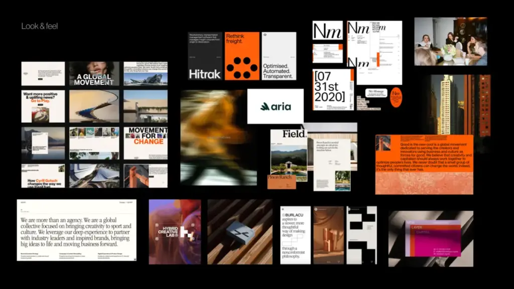
Look and feel boards compiled during this stage are explicitly distinct from standard aesthetic inspiration folders. Rather than showcasing visuals the team merely finds appealing, they function as rigorous perception boards. The designer curates external references informed directly by the workshop findings—incorporating desired audience perceptions, acknowledged category tensions, competitor design codes, stakeholder disagreements, and core brand characteristics.
Building upon this visual baseline, design codes translate key strategic pillars into actionable visual principles. For instance, if a brand’s strategic narrative revolves around providing personalized support for unique life journeys, the design code might manifest through organic shapes, handwritten linework, and soft compositional structures. Conversely, if a parallel pillar emphasizes research-backed credibility for everyday life, the visual translation might introduce data snapshots, structured infographics, and crisp editorial layouts that reinforce institutional authority.

The final layer of this pre-concept foundation brings the dialogue down to the core building blocks of visual identity: typography, color palettes, logo styling, photographic direction, and broader graphic language. By establishing clear parameters regarding these fundamental elements, the design team is equipped with robust boundaries without rendering the eventual brand identity entirely predictable. The subsequent step remains creative concept design, but the entire project team approaches it liberated from vague adjectives, private expectations, and unaddressed strategic discrepancies.
Ultimately, the pre-concept phase ensures that the unveiling of the first design concepts never feels like an unpredictable guess or an alarming visual surprise. Instead, it positions the initial creative presentation as the natural, logical next evolution of a direction the entire organization has already explored, debated, and fully understood.