











In a significant update regarding the evolving landscape of mobile web design, Apple has officially acknowledged the constraints currently affecting the browsing experience on the iPhone Duo. As part of a new technical blog post detailing the capabilities of Safari 27.1, Apple’s Jen Simmons revealed that the company is actively exploring new methodologies to allow websites to better utilize the device’s outer display. This initiative aims to address a widely noted pain point among users and critics alike, who have found the current interface configuration to be restrictive.
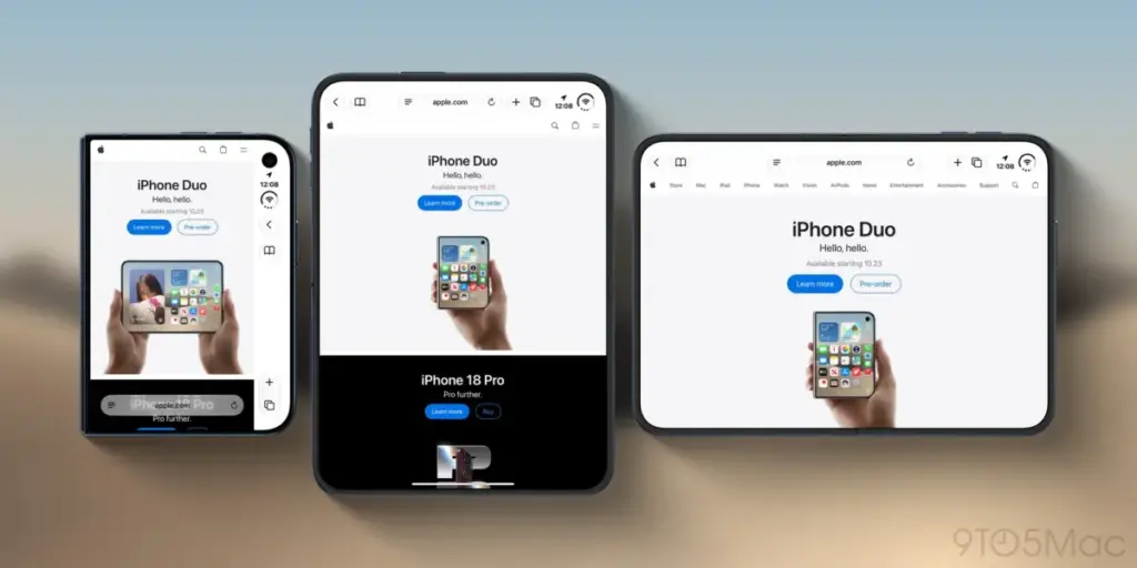
Since the launch of the iPhone Duo, one of the most frequently cited critiques in professional reviews has centered on the efficiency of the device’s outer screen. Specifically, the implementation of Safari’s right-aligned browser controls has become a point of contention. Because these controls occupy a substantial portion of the already limited 5.4-inch outer display, the space remaining for actual web content is often rendered unusually narrow. For users who rely on the outer screen for quick interactions, the result is an experience that feels cramped and less intuitive than the expansive interface found on the device’s inner, foldable display.
The frustration surrounding this design choice was notably highlighted in recent reviews, including coverage from this outlet. As noted in an analysis published earlier this week, the inherent challenge lies in the fact that the web, in its current state, is not inherently optimized for the unique, narrow form factor of the iPhone Duo’s outer panel. While Apple’s decision to keep controls static rather than overlaying them on top of website content—which could obscure vital buttons or text—was likely made to prevent accidental clicks or visual clutter, it has inadvertently prioritized safety over visual immersion. The consensus among early adopters is that while the inner display offers a seamless, premium browsing experience, the outer display currently feels like a compromise that does not fully leverage the potential of the hardware.

Recognizing this, Apple is now signaling a pivot. In her recent post on the WebKit blog, Jen Simmons, a prominent advocate for web standards and design at Apple, addressed these concerns directly. She explained that the company is keenly aware that websites currently lack the technical capability to extend their visual elements behind the browser’s controls on the outer display. By acknowledging this limitation, Apple has effectively opened the door for a collaborative effort between its engineering teams and the global community of web developers to find a more elegant solution.
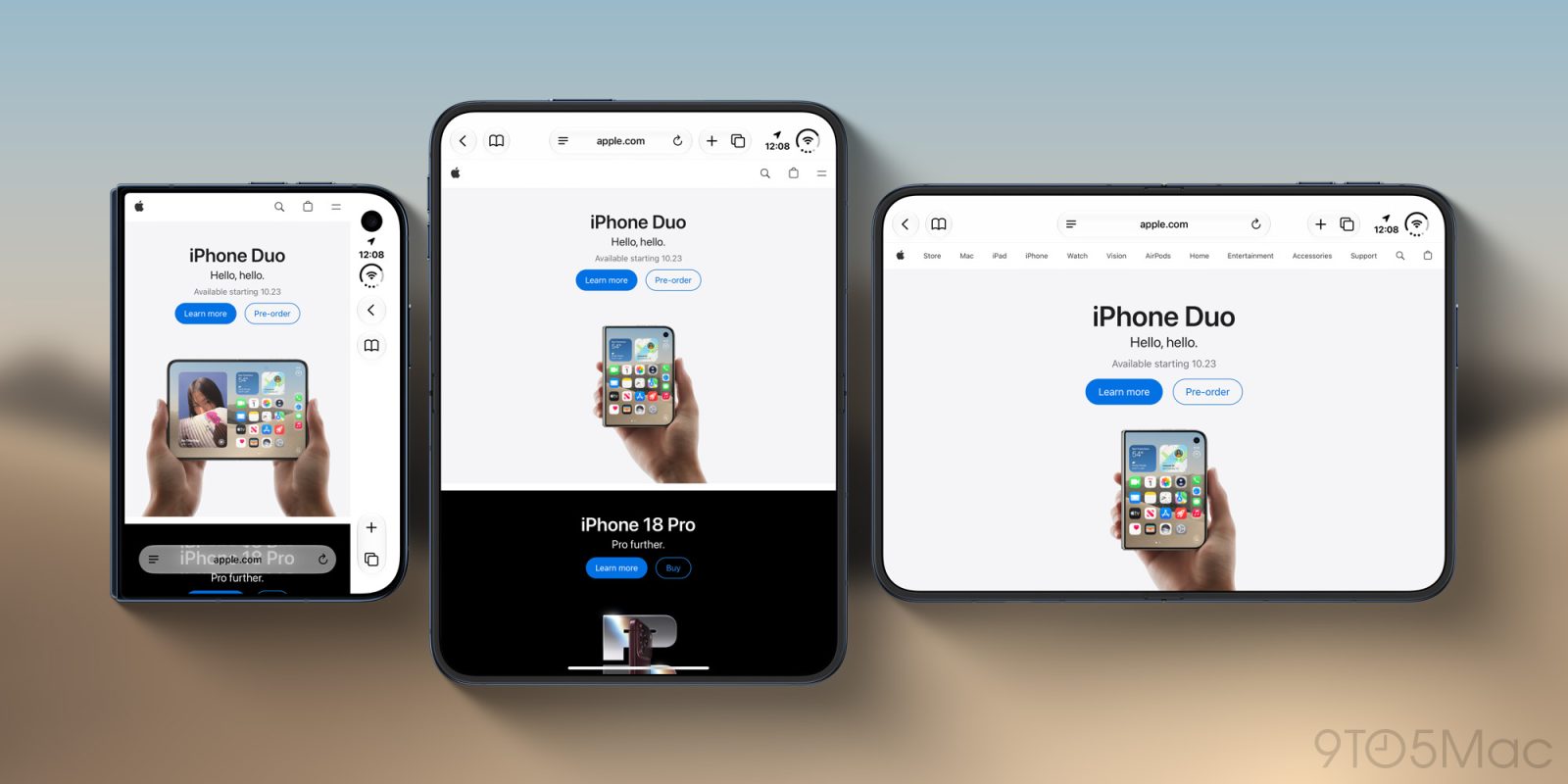
Simmons’ post emphasizes that Apple is looking for a solution that balances creative freedom with the necessity of a user-friendly interface. She noted that the company’s designers and engineers are interested in giving developers the agency to use that "lost" space in more creative ways. For instance, a website’s header background or a consistent brand color scheme could theoretically extend across the full width of the display, rather than being truncated by the rigid, right-aligned control bar. Such a change would allow for a more cohesive, high-end look that feels native to the hardware, rather than like a standard webpage simply shrunk down to fit a narrow window.
However, the implementation of such a feature is far from straightforward. Simmons cautioned that simply forcing websites to adopt the viewport-fit="cover" meta tag—a common tool used to allow content to bleed into the safe areas of a display—could lead to significant accessibility and usability issues. Many existing websites are not coded with the specific geometry of the iPhone Duo in mind. If developers were to force content into the area behind the browser controls, they might inadvertently hide critical navigation buttons, search bars, or interactive elements behind the UI, rendering those sites difficult or impossible to navigate.
This dilemma illustrates the tension between the fluid nature of the web and the rigid design of mobile hardware. Because the web is meant to be universal, forcing a "cover" implementation could break the functionality of millions of pages that were designed for traditional, rectangular smartphone screens. Apple’s challenge, therefore, is to create an API or a set of design standards that provides enough control to be useful, while remaining "foolproof" enough to prevent a poor user experience.
In light of these complexities, Apple is taking an unusually transparent approach by inviting the developer community to participate in the solution-finding process. Rather than dictating a top-down fix, the company is soliciting feedback, design patterns, and potential workarounds from the professionals who build the web. The goal is to identify a standardized approach that could be implemented in future versions of Safari, ensuring that when content does extend into the margins, it does so in a way that is both visually appealing and functionally sound.

This outreach marks a broader trend in how Apple handles the intersection of hardware innovation and software development. With the rise of foldable technology, the "one size fits all" approach to web design is becoming increasingly obsolete. As devices like the iPhone Duo continue to gain traction, the pressure on the browser to adapt to these shifting physical parameters grows. By initiating this dialogue, Apple is not just looking for a quick fix for the Safari UI, but is likely laying the groundwork for how browsers will handle foldable and dual-screen form factors in the years to come.
For developers and designers who have been struggling to optimize their content for the iPhone Duo, this invitation for feedback is a significant opportunity to influence the future of Safari’s interface. Apple has encouraged interested parties to review the full details provided on the WebKit blog and to contribute their ideas through the appropriate channels. While no specific timeline for a software update has been provided, the acknowledgement of the issue is a clear signal that change is on the horizon.
Ultimately, the goal is to bridge the gap between the iPhone Duo’s two distinct browsing environments. While the inner screen will likely remain the primary choice for deep reading or complex tasks, improving the utility of the outer screen is essential for the device to fulfill its promise as a versatile, dual-purpose tool. By empowering developers to take ownership of the full display, Apple hopes to turn a current design limitation into a showcase of what the mobile web can look like on the next generation of hardware. As the industry watches, the outcome of this collaboration will likely serve as a blueprint for how mobile browsers manage the increasingly diverse physical landscapes of modern smartphones. For now, users can expect that their feedback—and that of the developer community—will play a central role in shaping the next iteration of the Safari experience.