










When designers sit down to build navigation menus, dropdowns, and collapsible sections, one seemingly minor decision routinely sparks debate: which icon should represent an expanding and collapsing accordion? While the visual details might appear trivial at first glance, recent UX research reveals that the choice of icon carries significant weight, directly dictating how users interact with web interfaces and whether they encounter frustrating usability roadblocks.
Recent findings from the Nielsen Norman Group (NN/g) offer a comprehensive look at accordion icons, examining why split menus are fundamentally harmful, why separating text labels and icons into entirely different actions hurts the user experience, and why the humble caret remains the safest and most reliable icon choice for web designers.
The Problem with Custom Icons and No Visual Signifiers
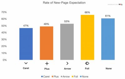
The findings regarding iconless navigation menus confirm long-standing industry suspicions: when a menu item features no icon at all, users overwhelmingly expect that tapping or clicking on it will take them directly to a brand-new page. Without a clear visual cue signaling expansion, users interpret the interactive element as a standard hyperlink.
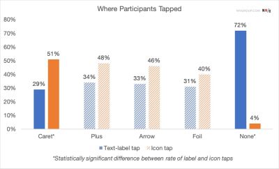
Furthermore, users frequently struggle with overly stylized custom icons. Because bespoke designs rarely establish a universal design standard, they fail to clearly signal that clicking will trigger an accordion drop-down. Observational studies demonstrate that users tend to tap fairly equally on both the icon and the text label across most standard icon variations, meaning that whatever visual signifier a designer chooses actually affects the entire hit area of the component, rather than just serving as a minor graphical decoration.

Many interface designs attempt to overcomplicate the user experience by introducing dynamic arrows and carets that point in various directions depending on whether the accordion is open or closed. Yet, extensive user testing proves that developers and designers generally do not need to rely on complex arrows just to indicate a standard link to a category page.
The most straightforward rule of thumb is remarkably simple: if a specific element is meant to function purely as a link, the easiest and most effective method is to simply underline it. While plain text links might lack visual flair, they work reliably every single time without confusing the user’s mental model.
Confusing Behavior with Arrows and Split Buttons
Navigational confusion often deepens when designers introduce directional arrows into dropdown menus. For instance, using a right-facing arrow icon does not inherently create a strong expectation of navigating directly to a new page. Conversely, placing the exact same arrow pointing downward does not automatically imply that an accordion menu will smoothly expand upon being clicked or tapped.
Compounding this issue is the prevalence of split buttons within modern web design—a pattern where the text label links directly to a destination page, while the adjacent icon is solely responsible for opening and closing the accordion. Usability testing consistently shows that split menus are harmful. They divide a single container into conflicting touch targets, leading to frequent user errors and frustration.

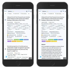
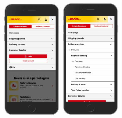
Instead of forcing a split interaction, web research indicates it is far more reliable to design the main category container so that tapping it opens the underlying menu. To grant users direct access to the category page itself, designers can easily incorporate a dedicated overview link safely contained directly inside the expanded menu list. Real-world implementations from major organizations, such as the logistics and shipping giant DHL, demonstrate the effectiveness of this approach by eliminating unnecessary directional arrows, abandoning split menus entirely, and consistently providing clear "Overview" links within each expanded section.
The Double-Edged Sword of Plus Signs and Arrows
When looking at alternative indicators, web designers frequently turn to plus and minus signs, or vertical arrows, to signal expanded and collapsed states. While these symbols generally function well enough in basic contexts, they carry distinct drawbacks stemming from semantic overload.
Plus signs, for example, have accumulated a wide variety of meanings across the digital landscape. Depending on the application, a plus sign can signify saving an item for later, adding a product to a shopping cart, zooming into an image, or expanding a section. This heavy overloading of meaning can become particularly problematic in complex multi-level navigation structures where multiple tiers of menus remain open simultaneously.
Similarly, vertical arrows can be interpreted in numerous ways. Users might associate them with scrolling down a page, sliding through a carousel, locating the next search match, or jumping directly to a specific portion of a document. While both plus-minus symbols and vertical arrows are widely understood by general audiences, their varied semantic baggage makes them prone to misinterpretation depending on the surrounding context of the interface.
Wrapping Up the Research
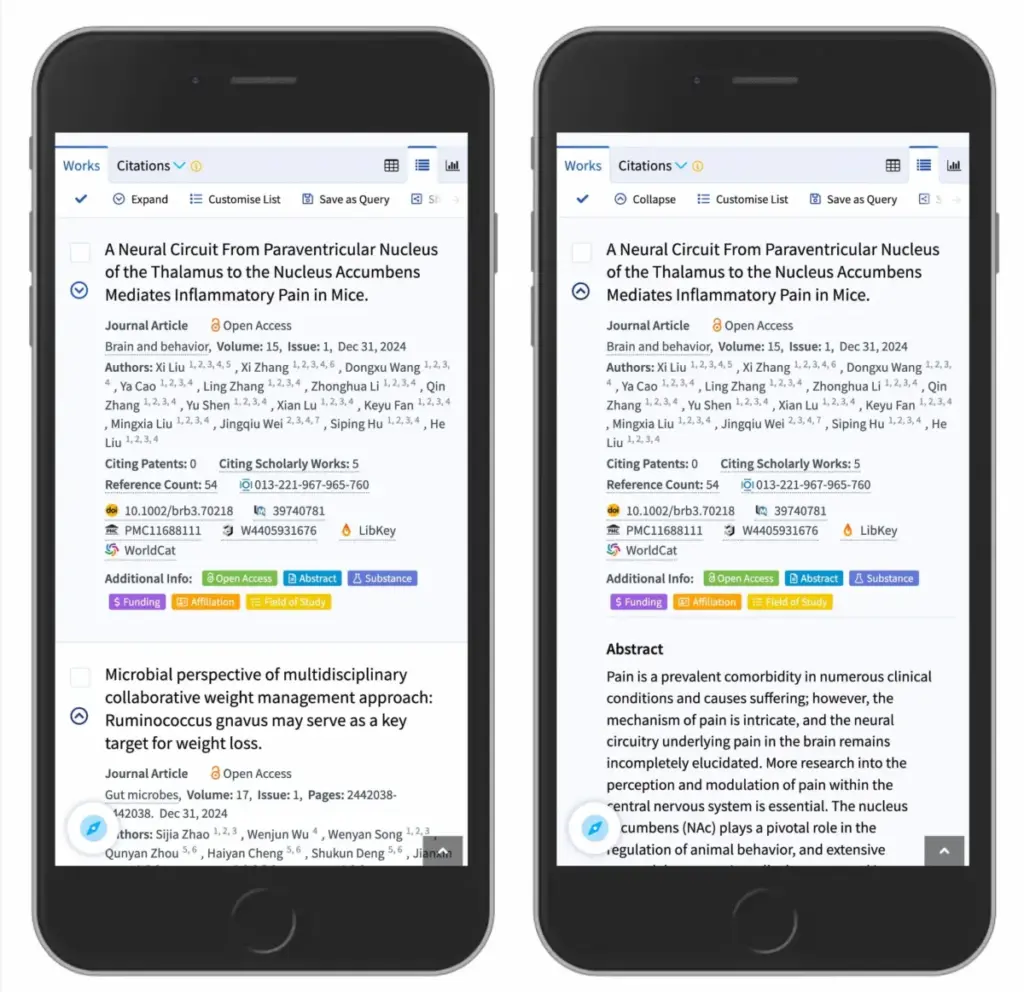
Ultimately, web usability research points to a clear winner for interface design. The safest and most dependable choice for interactive accordions is the downward-facing caret or triangle by default, which then transitions to point upward or sideways upon user interaction. If a designer requires an alternative visual indicator, standard plus and minus symbols generally perform reliably as well, provided they are used consistently.
At the same time, interface designers do not need to clutter their layouts with redundant icons or extraneous arrows just to explain where links lead. Split menus should be avoided because they consistently generate more user mistakes than they solve. Instead, a well-designed accordion should feature a single unified button or dropdown area that performs one predictable function: showing all available options and allowing users to seamlessly drill down into the content.

When a direct hyperlink is necessary, the title should be linked directly to its target page and clearly underlined. Across digital products ranging from enterprise search engines like Lens.org to large-scale consumer portals, keeping interface interactions simple consistently yields a superior user experience.