












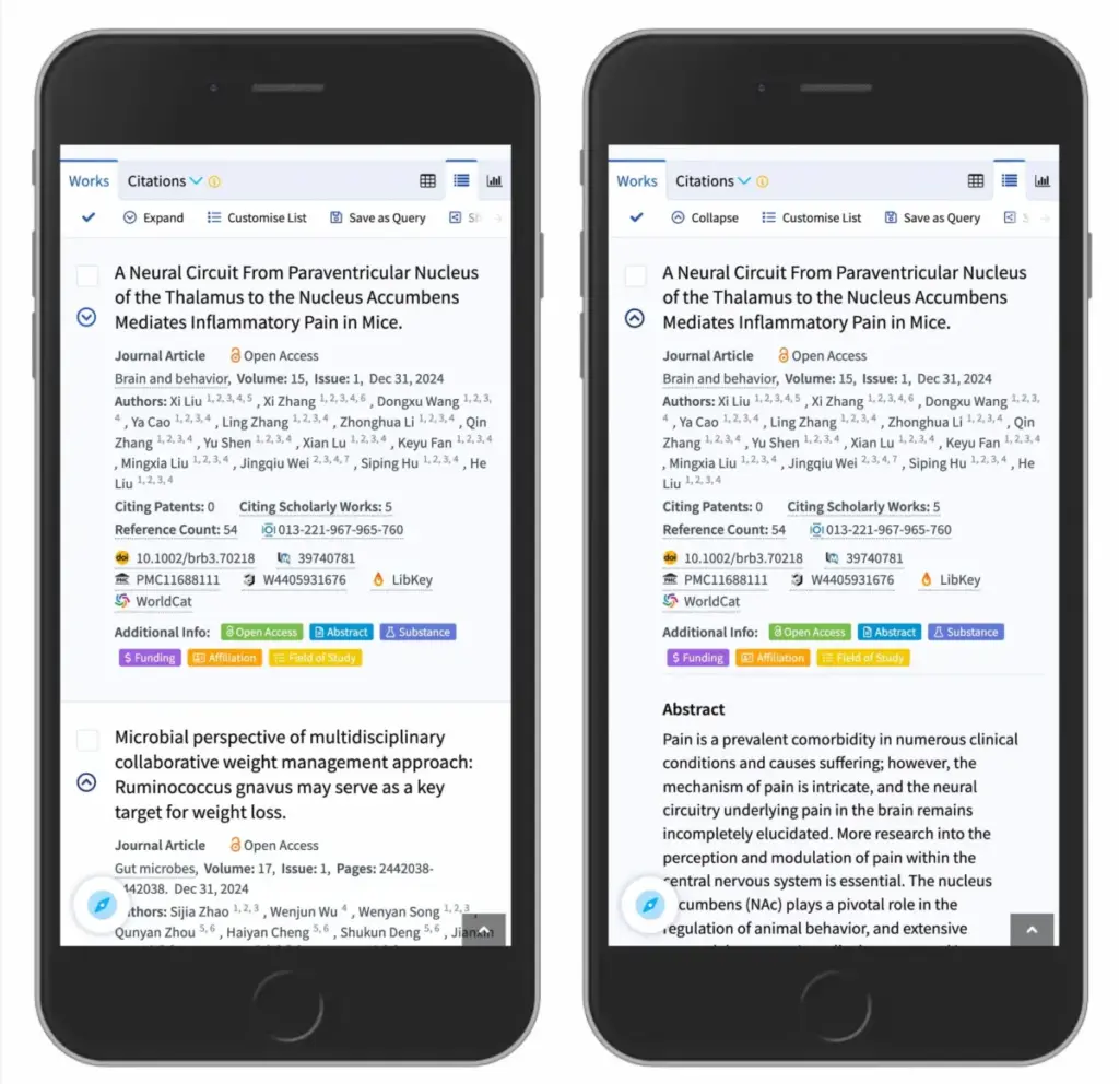
 Standard
Choosing the Right Accordion Icon: Why Research Shows Carets Outperform Arrows and Split Menus
When designers sit down to build navigation menus, dropdowns, and collapsible sections, one seemingly minor decision routinely sparks debate: which icon should represent an expanding and collapsing accordion? While the visual details might appear trivial at first glance, recent UX research reveals that the choice of icon carries significant weight, directly dictating how users interact…