










Despite achieving near-universal browser support, CSS container queries remain surprisingly underused and frequently misunderstood across the web development community. Years after their introduction, developers continue to grapple with how these rules differ from traditional media queries, when to reach for each tool, and how container queries allow reusable components to respond naturally to the specific contexts in which they appear.
When container queries first shipped, many developers missed the initial announcement or reacted with immediate skepticism. Given that media queries have long anchored responsive web design, the initial impulse among many professionals was to question the necessity of an entirely new paradigm. That hesitation, while common, highlights a broader knowledge gap in modern front-end engineering.
Data from recent industry surveys underscores this adoption paradox. According to the State of CSS survey, an overwhelming 86% of developers are aware of container queries, yet only 41.4% actually use them in production. While surveys can carry inherent biases, this metric serves as a strong indicator of an industry-wide hesitation. During industry events like SmashingConf Amsterdam, prominent educators and developers have pointedly noted that container adoption rates have been remarkably low. This reluctance is particularly striking given that the ability for individual components to adapt to the size of their outer container sat at the top of CSS feature wishlists for years.


The root of this underutilization lies in a visual similarity. At first glance, container queries look almost identical to media queries. Because they share a familiar syntax, it is easy to assume they serve similar purposes and operate under the same fundamental rules. They do not.
To understand the distinction, it helps to examine what a traditional media query actually asks the browser. When writing a standard media query, a developer asks a single question: How wide is the viewport right now? Media queries evaluate the browser window or device screen. While this worked well for early responsive web design, it creates significant friction in modern component-driven architectures.
Consider a reusable card component placed inside a narrow grid cell within a massive desktop display. A traditional media query checking for a large screen width will fire and apply expansive desktop styles, even though the card itself might only have a narrow horizontal space to occupy. Eventually, the contents of the component deform, overflow, or cramp up because the outer viewport size bore no relation to the actual container holding the element. As industry experts often point out, media queries lack situational awareness; they only observe the macro environment of the browser window rather than the micro environment of the component.

Container queries, by contrast, look inward. They shift responsive design away from abstract viewport thresholds and toward the immediate space available to a component. Instead of asking how wide the screen is, a container query asks how much space is available in a specific spot at that exact moment. By registering a parent wrapper as a container, components can independently decide when to change their layout based entirely on their direct surroundings.
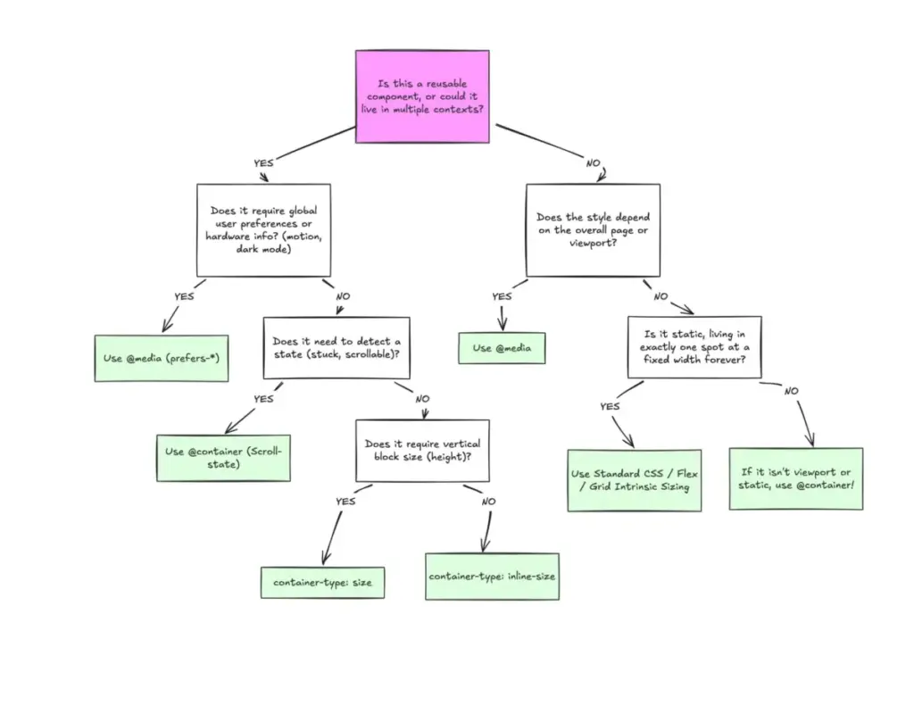
This introduces a clear division between macro layouts and micro layouts. Media queries remain ideal for macro layouts that govern overarching page structure, such as major grid systems, site headers and footers, and system preferences like color schemes or touch capabilities. Container queries are designed for micro layouts—the self-contained widgets, cards, forms, and navigation menus that live inside those major structures. Modern web applications feature thousands of unique viewport sizes, making it nearly impossible to account for every permutation using screen-based breakpoints alone. Component-driven design solves this fragmentation by tying layout logic to the container rather than the viewport.
This contextual shift extends beyond structural changes into other areas of design, such as typography and internal layout states. Developers have traditionally relied on viewport-relative units to implement fluid typography that scales with the screen. However, if that typography lives inside a component that gets relocated to a narrow sidebar, viewport-based scaling can cause the text to become disproportionately large or small. Container queries introduce specialized relative units that allow fluid typography to scale directly with the container, keeping the component entirely self-contained.

Similarly, container queries offer sophisticated workarounds for internal layout events that media queries cannot detect. Standard CSS cannot automatically identify when flex items wrap onto a new line, as media queries are structurally blind to internal layout shifts. By pairing container queries with flexible layout properties, developers can detect when items wrap and trigger style updates without resorting to heavy JavaScript resize observers.
Despite these advantages, container queries introduce specific side effects and technical caveats that require careful handling. A container cannot query itself due to the risk of infinite loops, meaning developers must establish proper parent-child wrapper relationships to target descendant elements effectively. Furthermore, querying a container’s vertical or block size can inadvertently collapse layouts to zero if explicit heights or aspect ratios are not defined, making inline-size queries the safer default. Additionally, container queries cannot currently accept custom property values as breakpoints, preventing developers from dynamically passing CSS variables into query conditions.
Ultimately, container queries are not meant to entirely replace media queries. Both tools occupy vital and distinct roles in modern web development. Media queries excel when managing page-level structures tied directly to the browser window, while container queries provide the precision needed for reusable components that must adapt gracefully to any environment. Understanding this separation of concerns is essential for building resilient, adaptable user interfaces on the modern web.