









When a corporate branding project goes off track, the breakdown rarely happens at the final logo stage. Instead, the root of the problem is almost always planted much earlier, during the strategic phase when abstract descriptors like “modern,” “trustworthy,” “premium,” “friendly,” and “disruptive” are left undefined. The inevitable result is a profound disconnect between what a brand is supposed to communicate strategically and what a designer is ultimately tasked to create visually.
To bridge this foundational gap, design and branding professionals are increasingly turning their attention to what can be described as the “pre-concept” phase. This critical window of work occurs after the initial client kickoff but well before any original visual direction or identity concepts are sketched out in collaborative software like Figma. By actively researching brand context, uncovering hidden assumptions among stakeholders, and forging a shared direction into a solid visual foundation, teams can ensure that their first design concepts are rooted in genuine consensus rather than guesswork.
At the beginning of any typical branding initiative, designers are flooded with inputs: a creative brief, notes from early stakeholder interviews, a collection of competitor references, and perhaps a loose moodboard or a curated list of adjectives. Armed with these materials, they are expected to produce visual concepts that simply "feel right." However, judging what feels right becomes exceptionally difficult when the broader team has never reached a concrete agreement on what the brand is fundamentally supposed to communicate to its target audience.

Consider the experience of one agency working with a health tech company that stated it wanted its new brand to look modern, trustworthy, and disruptive. Initially, the term “disruptive” suggested a push toward something bold, loud, and unconventional. But as deeper conversations unfolded, it became evident that disruption, in their specific context, still needed to feel entirely credible inside a remarkably conservative healthcare environment. Because their primary clients were large government medical institutions, a brand identity that felt overly rebellious, experimental, or visually loud would fail to inspire the exact kind of trust required in that sector. In short, their practical definition of "disruptive" turned out to be far more traditional than the literal word implied.

The underlying issue was not that the client used incorrect language, but rather that the vocabulary was far too broad to effectively guide downstream design decisions. Before a designer can successfully translate a corporate strategy into a compelling visual concept, those ambiguous words must be rendered remarkably specific. What kind of modern aesthetic are they aiming for? Trustworthy in what precise way? Disruptive compared to which specific competitors? And how far can the brand safely stretch away from category expectations before it alienates its core audience?
While a comprehensive brand identity process for digital products encompasses multiple pillars—ranging from high-level strategy and visual concepts to full-scale implementation and asset libraries—the pre-concept phase specifically targets the preliminary groundwork. It serves as a practical bridge between the core meaning of a brand and how it might eventually begin to manifest visually. The first natural place to construct that bridge is the brand workshop, where broad discovery discussions must be refined into a crystal-clear understanding of the overall brand context.

Stage 1: Research The Brand Context
A standard brand workshop will naturally cover all the traditional discovery topics, including the core business model, overarching goals, specific products or services, the competitive landscape, and the target audience. However, experienced designers emphasize a smaller, highly focused set of questions that are easy to skip but extraordinarily useful before any visual work begins. These inquiries are designed less for collecting dry business facts and more for actively clarifying perception. They help the extended team understand precisely what beliefs the brand needs to instill in people, where it must maintain absolute credibility, and which existing industry conventions it should either respect or challenge.
Perception sits squarely at the center of brand discovery because a brand ultimately takes shape within someone else’s mind. As brand strategist Marty Neumeier famously observed in The Brand Gap, a brand is fundamentally a person’s gut feeling about a product, service, or company. If the brand lives entirely in external perception, discovery workshops must rigorously clarify the exact perception the team is striving to cultivate.

Without careful probing, brand attributes often sound completely aligned before they are genuinely understood. For instance, a stakeholder might declare that a new brand identity should feel "premium," prompting widespread nodding around the room. Yet, upon closer inspection, one person might envision a refined and editorial minimalist aesthetic, another might picture something expensive and exclusive, and a third might lean toward a clean, quiet, and sparse design language. While the word sounds shared, it threatens to lead the design team toward three completely different visual systems.
When a team manages to define these key attributes within their proper context, designers are no longer forced to work from vague, open-ended adjectives. Instead, they can tackle a much clearer, more actionable design problem. Because words alone are rarely sufficient for this transition, incorporating exercises that force stakeholders to think through images, relative associations, and spatial mapping can prove invaluable. As Jake Knapp noted in GV’s framework for the Three-Hour Brand Sprint, the primary objective of these exercises is to transform the abstract notion of a corporate brand into something tangible and concrete.

This active participation is crucial. When clients are merely presented with a finished strategy deck, they often remain passive participants, agreeing in the meeting without fully recognizing the hidden assumptions they bring to the table. But when they are required to physically place competitors on a perceptual map, select specific evocative imagery, or explain why a particular reference feels credible to them, their underlying attitudes, beliefs, and potential disagreements come to light early. This surfaces conflicts long before they have any opportunity to derail the first official concept review.
Competitor Perception Mapping and Visual Brand Drivers
To operationalize this discovery, facilitators often begin by looking outward at the competitive category before turning inward toward the brand itself. In the competitor perception mapping exercise, teams review screenshots of rival brands, websites, product interfaces, and marketing touchpoints, placing them onto a two-axis grid. This exercise is not about judging which competitors feature "good" or "bad" design, but rather about understanding how the client group reads their category. It exposes what they perceive as credible, generic, overly conservative, or experimental, while simultaneously highlighting open visual territory for their own brand.

The axes for these maps are deliberately chosen based on the specific tensions the brand needs to resolve. For a health tech company balancing innovation with institutional trust, the map might measure properties from traditional to progressive, and from corporate to human. For a fintech startup seeking distinction without losing credibility, the grid might range from understated to bold, and from accessible to exclusive. The most valuable output of this exercise is frequently not the final map itself, but the healthy disagreements it sparks among stakeholders who read the exact same market actors in vastly different ways.
Following the category review, teams often pivot inward using visual metaphor exercises where stakeholders select unrelated images across categories like transport, architecture, typography, and objects. Crucially, participants are instructed to choose images that represent the company rather than their own personal aesthetic tastes. Selecting whether a company resembles a quiet electric car versus a high-speed train, or a soft lounge chair versus a heavy boardroom table, helps unearth deeper layers of brand perception.

By analyzing the adjectives and justifications accompanying these selections, patterns and contradictions emerge. One stakeholder may view the company as refined and calm, while another sees it as energetic and experimental. Surfacing these differences provides invaluable material for the design team, ensuring that aesthetic preferences are completely separated from true brand expression.
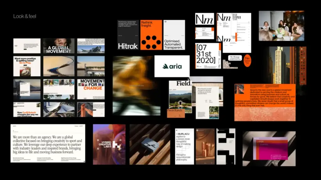
Once a workshop has successfully surfaced these core assumptions, subsequent sessions can translate that shared understanding into a tangible visual foundation. Rather than jumping straight to logo designs, teams work through connected layers: look and feel boards, design codes, and early asset directions. Look and feel boards act as perception boards rather than preference collages, helping teams discuss the exact nuances of qualities like trust, modernity, and human warmth.

Design codes take this a step further by translating strategic brand pillars into concrete visual principles, pairing ideas like "personalized support" with organic shapes and softer compositions, or "research-backed credibility" with structured infographics and editorial layouts. Finally, the brand asset direction brings the conversation down to foundational building blocks such as typography, color palettes, photography styles, and graphic languages.
By investing the necessary time and rigor into this pre-concept phase, design teams can establish clear, meaningful boundaries for their creative exploration. The resulting first concept stops feeling like a blind guess or an anxiety-inducing reveal, transforming instead into the logical next step of a journey the entire client team already understands and believes in.