










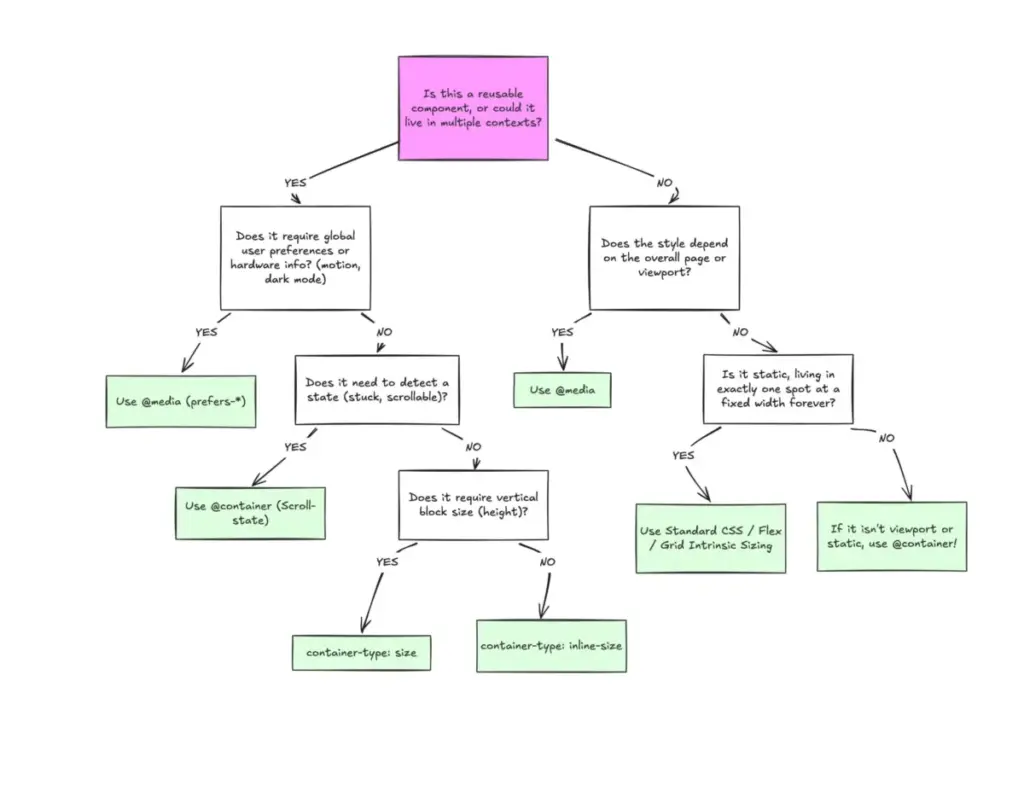
Despite achieving robust, cross-browser support that now sits at roughly 94 percent globally, CSS container queries remain surprisingly underused and frequently misinterpreted across the front-end development community. Industry data reveals a striking paradox: while the vast majority of web developers are fully aware of the feature, less than half actually incorporate it into their daily workflows. Experts point out that the root cause of this under-adoption is not a lack of utility, but rather a persistent tendency to treat container queries as mere replacements for traditional media queries.
When CSS container queries first arrived on the scene, many developers experienced a familiar cognitive hurdle. The immediate reaction for seasoned engineers was often skepticism, questioning the necessity of a new layout tool when media queries had governed responsive web design for well over a decade. Looking back, that initial hesitation was part of a widespread industry phenomenon.
According to data from the State of CSS survey, an overwhelming 86 percent of developers are aware of container queries, yet only about 41.4 percent actively use them in production environments. Industry figures, including prominent educator and speaker Kevin Powell during his address at SmashingConf Amsterdam, have openly highlighted that container query adoption has been remarkably sluggish. This lack of uptake is particularly ironic given that the ability for modular components to adapt fluidly to the size of their outer containers has occupied the absolute top of developer wishlists for years.

The core issue is not simply how many developers are adopting the feature, but rather how they are applying it. From early prototyping attempts to production codebases, many teams are implementing container queries incorrectly. This misapplication largely stems from visual familiarity. At first glance, a container query looks remarkably similar to a traditional media query. Because the syntax shares a parallel structure, it is easy to assume they serve identical purposes and function through the same logical mechanics.
They do not.

The Core Difference: Viewport Proxies vs. Inward-Looking Layouts
To understand the distinction, it helps to examine what standard media queries actually ask the browser. When a developer writes a media query checking for a minimum width of 1024 pixels, the browser is being asked a single, narrow question: "How wide is the screen right now?"
Media queries answer that question reliably, but they operate entirely as an outward-looking macro layout system. The viewport has always served as a proxy for environment size. However, modern web development relies heavily on reusable components—such as cards, widgets, navigation bars, and forms—that must function seamlessly across drastically different contexts.
Consider a standard card component placed inside a narrow grid cell measuring 300 pixels wide on a sprawling 1920-pixel desktop monitor. A media query evaluating the viewport width will see a 1920-pixel screen, determine that the minimum width threshold has been met, and apply the wide-screen layout styles. Meanwhile, the card itself is trapped in a cramped 300-pixel container, leading to broken layouts, text overflow, and cramped interfaces. As Kevin Powell noted, media queries are fundamentally limited because they lack deep contextual awareness; they only observe the macro window rather than the micro environment where components actually live.
Container queries fundamentally shift this perspective by looking inward. Instead of asking how wide the global browser window happens to be, a container query asks how much space is available in a specific, local spot right now. By registering an element as a container using inline-size properties, child components can independently evaluate their immediate parent wrapper. If the parent container meets a specific width threshold, the component adapts its layout accordingly, regardless of whether the user is browsing on a mobile phone or a massive desktop display.
Macro Layouts Versus Micro Layouts
A helpful framework for distinguishing between the two approaches involves categorizing design decisions into macro layouts and micro layouts.

Media queries remain the ideal tool for macro layouts—the structural architecture of the entire page. This includes major grid systems, global headers and footers, operating system preferences like dark mode via color scheme queries, and hardware capabilities such as touch screen detection. These are global truths that apply uniformly across the entire page structure.
Container queries, by contrast, are designed for micro layouts. They govern the internal components that populate the macro structure. Elements should not automatically transform into a tablet-sized layout simply because an arbitrary viewport threshold of 768 pixels has been crossed. Instead, a component should shift its internal layout the moment it is allocated enough physical space to do so comfortably, whether that happens within a mobile screen or tucked inside a narrow desktop sidebar. Modern web data underscores the necessity of this shift, with researchers tracking over 2,300 unique viewport sizes across contemporary devices, rendering rigid, screen-based breakpoints increasingly obsolete for component design.
This paradigm shift extends naturally into other design patterns, such as typography. Traditional responsive typography relies heavily on viewport-relative units like vw or vh paired with CSS clamp functions. While effective at the page level, scaling font sizes based on the global screen width causes typography to break down when a component is relocated to a confined sidebar. Container queries introduce dedicated units, such as cqi and cqw, which measure against the inline size of the component’s container rather than the viewport. When combined with fluid typography techniques, these container units ensure that text scales harmoniously in direct relation to the component itself, keeping all layout logic strictly self-contained.
Furthermore, container queries unlock advanced layout behaviors that were previously impossible without heavy JavaScript interventions, such as Flexbox wrap detection. Standard CSS lacks native pseudo-classes or query conditions to detect when flex items automatically wrap onto a new line due to spatial constraints. By nesting container queries inside flexible items, developers can establish reliable workarounds where container-level queries trigger layout shifts the moment flex items expand to fill available row space, completely eliminating the need for complex JavaScript observers.
Managing Side Effects and Limitations
Despite their versatility, container queries introduce specific side effects and technical constraints that developers must navigate carefully.

First, a container cannot query its own dimensions. Attempting to apply container properties and query conditions to the exact same element creates a logical infinite loop, preventing the code from functioning. Developers must establish a distinct parent-child relationship by wrapping elements in a dedicated container element that handles the sizing logic while its descendants respond accordingly.
Second, querying a container’s block or vertical size without explicit height definitions can cause layout collapses. If a developer sets a container type to size—governing both horizontal and vertical dimensions—the browser calculates the container’s layout independent of its children. Without an explicit height, min-height, or aspect-ratio declaration, the browser collapses the container to zero pixels, wiping out visible content. For this reason, industry best practice favors querying inline-size exclusively unless vertical dimensional queries are strictly necessary.
Finally, container queries currently cannot accept CSS custom properties or design tokens directly within their evaluation parameters. Because custom properties cascade dynamically through the DOM tree, allowing them inside container queries would introduce severe computational circular dependencies that the current CSS specification cannot safely resolve.
Ultimately, container queries are not meant to entirely replace media queries. Both systems occupy vital, complementary roles in modern web architecture. Media queries manage the broad macro layout of the page in relation to the global viewport, while container queries handle the intelligent, responsive behavior of modular components based on their immediate surroundings. Recognizing this clear separation of concerns allows developers to build resilient, highly adaptable interfaces tailored to the modern multi-device web.