










When users encounter an expandable menu item on a modern website or web application, a split-second cognitive calculation takes place. Does tapping this element take them directly to an entirely new page, or does it gently unfold a nested list of options right where they are? According to recent research from the Nielsen Norman Group (NN/g), the visual cues designers rely on to answer this question play a massive role in usability—and getting those cues wrong can lead to user frustration, misclicks, and broken navigation patterns.
The debate over the most reliable icon to signal expansion and collapsing in accordions has occupied user experience designers for years. While digital product teams frequently experiment with custom graphics, arrows, chevrons, triangles, and plus-minus signs, user research reveals distinct behavioral patterns that favor simplicity above all else. More importantly, recent usability findings highlight why split menus are fundamentally harmful to the user experience, why separating the actions of icons and text labels creates unnecessary friction, and why the humble caret stands out as the safest and most reliable icon choice in interface design.
Decoding User Expectations: No Icon Means Page Navigation
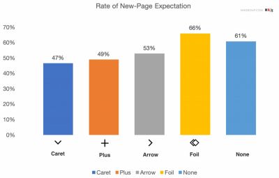
The findings regarding iconless navigation elements confirm long-standing intuitions in web design: when a menu item features no accompanying icon whatsoever, users overwhelmingly expect that tapping or clicking on it will transport them directly to a new page. Without a visual signifier indicating embedded hierarchical content, the brain defaults to the standard hyperlinking paradigm of the web.
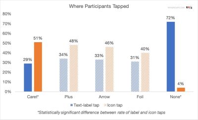
Furthermore, users frequently struggle with overly stylized or custom icons because these bespoke graphics rarely communicate explicit accordion behavior. Usability studies tracking user interaction zones reveal that people tend to tap fairly equally across both the text label and the accompanying icon for the vast majority of interface patterns. Because the target area functions as a single unified hit zone in the minds of users, the chosen icon dictates the functional expectations for the entire interactive element, not just the graphical indicator itself.

Many interface designs attempt to overcomplicate state changes by utilizing an array of dynamic arrows and carets that rotate, shift, or point in various directions depending on whether the accordion is currently open or closed. However, comprehensive usability testing suggests that designers rarely need to deploy complex arrow systems merely to indicate a standard link to a category page.
The most straightforward rule of thumb remains remarkably simple: if an element is a standard link, the easiest and most effective way to communicate that function is to underline the text. Stripping away unnecessary arrows, carets, and ornamental decorations may feel visually unexciting to avant-garde designers, but this minimalist approach works flawlessly across every demographic and device class.
The Pitfalls of Arrows and Split Buttons
Navigational confusion often accelerates when designers introduce right-facing arrows into hierarchical menus. A right-facing arrow does not inherently trigger an expectation of navigating directly to a new page, nor does shifting that same arrow to point downward reliably signal that an accordion menu will expand upon interaction. This ambiguity makes arrows a risky choice for primary site architecture.
Compounding this issue is the persistence of split buttons in accordion patterns—a design anti-pattern where the text label links directly to a destination page while the accompanying icon is tasked with opening and closing the accordion. Usability testing consistently demonstrates that split-button accordions are actively harmful to the user experience. Users rarely parse the subtle visual distinction between tapping the text versus tapping the icon, leading to accidental page loads when they merely wanted to view sub-categories, or frustrating dead-ends when they wanted to visit the parent category.

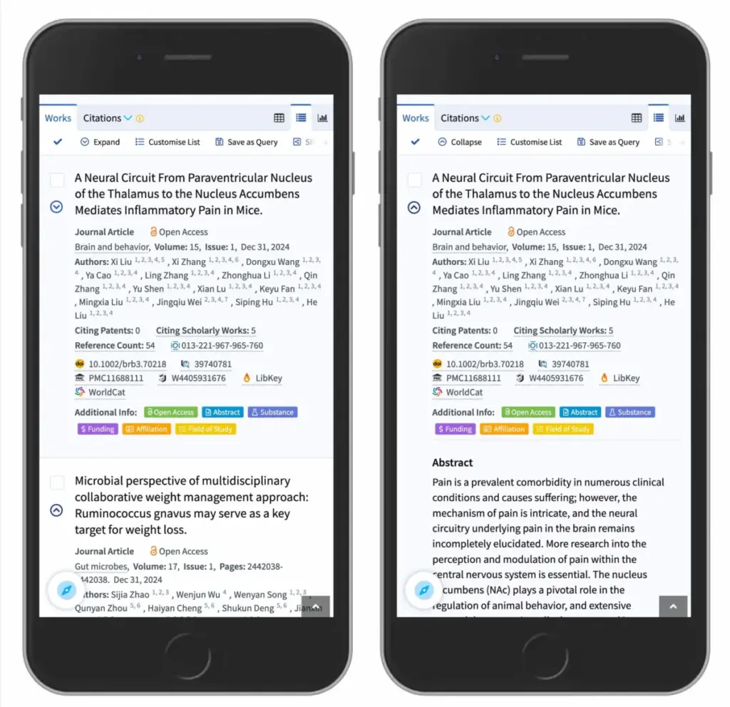
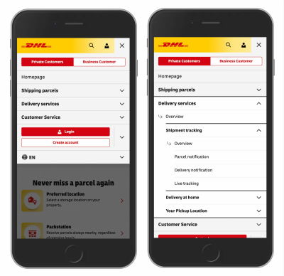
A far more reliable architectural pattern involves allowing users to tap anywhere on the main category container to expose the nested menu options, while embedding a dedicated link to the primary category page directly inside the newly revealed dropdown list. Real-world implementations by major global organizations, such as the logistics giant DHL, successfully utilize this pattern by eliminating extraneous arrows and split menus, opting instead for clear overview links housed cleanly within each expanded section.
The Overloaded Meaning of Plus-Minus Signs and Arrows
While plus and minus signs, alongside vertical and horizontal arrows, are widely recognized by web users to signal expanded and collapsed states, they carry significant baggage due to semantic overload. These symbols are burdened with multiple competing interpretations across different digital contexts.
A plus sign can mean anything from saving an item for later, adding a product to a shopping cart, zooming into an image, or expanding content. This multiplicity of meanings becomes particularly problematic in complex, multi-level navigation trees where multiple tiers of menus remain open simultaneously. Similarly, vertical arrows can suggest scrolling, sliding, finding the next search match, or jumping to a specific anchor point on a long-form page.
While plus-minus signs and traditional arrows remain functional and broadly understood, their heavy semantic loading makes them prone to misinterpretation depending on the surrounding interface layout. Designers who rely on these symbols must carefully weigh the potential for user confusion against clearer, more singular signifiers.
The Verdict on Interface Expansion
When distilling years of UX research into actionable design standards, the caret emerges as the clear victor for collapsible elements. The safest and most reliable choice for interface designers is to utilize a downward-pointing caret or triangle by default, transitioning it to point upward or sideways upon user interaction. When an alternative is required, standard plus and minus signs generally perform well, provided they are contextualized correctly within the navigation tree.
Ultimately, modern web architecture benefits from restraint. Designers do not need to blanket their menus with redundant icons and arrows to explain destination pathways. Split menus should be avoided entirely to prevent the high volume of user errors associated with fractured hit targets. By favoring a single unified button or dropdown that clearly exposes all nested options, and utilizing traditional underlines for direct text links, interface designers can build predictable, highly usable digital experiences where simpler is almost always better.