










Despite achieving broad browser support that now sits at roughly 94 percent globally, CSS container queries remain surprisingly underused and frequently misunderstood across the web development community. Years after their introduction into modern browsers, developers continue to grapple with how these component-level tools differ from traditional media queries, when to reach for each approach, and how container queries allow reusable components to respond naturally to the specific contexts in which they appear.
When container queries first shipped to production environments, many developers missed the initial rollout entirely. Upon discovering the feature, a common first reaction across the industry mirrored a fundamental point of confusion: why invest time in learning container queries when media queries already exist and have successfully handled responsive design for decades?
While that initial hesitation is understandable in hindsight, data from the developer ecosystem suggests the industry is slow to adapt. According to the State of CSS survey, an overwhelming 86 percent of developers are aware of container queries, yet only 41.4 percent actively use them in production projects. Industry experts have pointedly highlighted this discrepancy. During a presentation at SmashingConf Amsterdam, web developer and educator Kevin Powell emphasized that container query adoption has been remarkably low. This sluggish uptake seems paradoxical, given that the ability for individual components to adapt dynamically to the size of their outer container has occupied the top tier of developer wishlists for years.
The core issue is not necessarily how many developers are using container queries, but how they are using them. Many developers, including those experimenting with early implementations, tend to apply them incorrectly. The root of this misuse lies in a visual resemblance: container queries look almost identical to media queries at first glance. Because of this superficial similarity, it is easy to assume they serve the same overarching purpose and operate under the same mechanical principles. They do not.
To understand the distinction, it helps to narrow the focus to container size queries—a responsive design technique designed to react to the physical dimensions of a designated container. While experimental container style queries, which respond to a container’s computed styles, are also emerging, size queries represent the core paradigm shift currently being overlooked.
For the history of modern web design, the browser viewport has served as a proxy for layout adaptation. Media queries fostered the illusion that screen width alone dictates how a responsive application should adapt to its environment. When writing a traditional media query, a developer asks the browser a single question: How wide is the screen right now?
Media queries answer that question reliably based on the outer window dimensions. However, problems arise when a component—such as a flexible card layout—is placed inside a narrow grid cell that measures only 300 pixels wide on a sprawling 1920-pixel desktop monitor. The media query remains indifferent to the component’s immediate surroundings. Because the viewport width easily clears the threshold of a desktop-oriented media query, the desktop styles are applied, leaving the card crammed into a 300-pixel space where its contents quickly overflow, deform, or cramp up.
As Kevin Powell noted, media queries are not conceptually flawed, but they are inherently limited because they lack localized context. Developers often assume media queries possess far more awareness of the document structure than they actually do. Traditional responsive design has long trained practitioners to think of responsiveness purely as a macro-level system for shifting entire page structures, such as transforming a multi-column desktop layout into a single-column mobile view.
Container Queries Look Inward
Container queries introduce a fundamentally smarter approach by shifting the responsive burden away from the outer viewport and placing it inside the component itself. Instead of asking how much space the entire browser window has, a container query asks a localized question: How much space is available for me in this specific spot, right now?
By designating a parent wrapper as a container, a component can adjust its display properties based strictly on the inline or block dimensions of that immediate wrapper. If the parent container provides enough horizontal space, the component adopts an expanded layout; if the space shrinks, it gracefully falls back to a stacked or compact view. The component is entirely decoupled from the total size of the browser window.
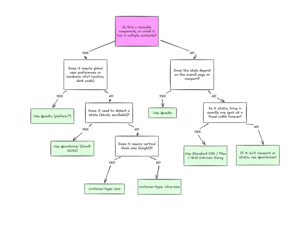
This introduces a clear division between macro layouts and micro layouts. Media queries remain the ideal tool for macro layouts, looking outward to manage major page structures, window-spanning headers, footers, primary grid systems, system preferences like dark mode, and device capabilities such as touch screens. Anything that governs the overarching page architecture belongs in the realm of the viewport.
Container queries, conversely, are built for micro layouts—the self-contained elements that live within the macro layout. Components like cards, widgets, forms, and localized navigation menus are prime candidates. Rather than forcing an element to become tablet-sized simply because the browser window crosses an arbitrary threshold like 768 pixels, a component should shift its layout when its immediate container provides enough room, regardless of whether that container sits in a mobile viewport or a narrow desktop sidebar.

The necessity for this localized approach becomes clear when considering the fragmentation of modern hardware. Industry metrics show that the web now features well over 2,300 unique viewport sizes. Attempting to account for every conceivable screen dimension through media queries alone is increasingly impractical. By shifting layout logic closer to the container rather than the viewport, developers rely on the actual content and its immediate environment to dictate layout behavior.
Fluid Typography and Flexbox Integration
This shift in perspective extends naturally into typography and internal component states. Historically, developers relied on viewport-relative units like vw and vh combined with media queries to build fluid typography that scaled with the user’s screen. While effective at the page level, this technique breaks down when a component is relocated into a constrained context like a sidebar, where the viewport size is entirely irrelevant. Scaled text can quickly become disproportionately large or small because it is tied to the wrong reference point.
Container queries solve this by introducing dedicated relative units, such as cqi and cqw, which measure against the container rather than the viewport. By pairing these container units with CSS functions like clamp(), developers can create fluid typography that scales harmoniously with the component itself, keeping the styling logic self-contained.
Furthermore, container queries can detect certain states within a component’s internal layout—a capability traditionally closed off to media queries. Because media queries only observe the external browser window, they remain blind to internal layout events such as flex items wrapping onto a new line. When building a horizontal menu or a card grid using Flexbox, CSS traditionally lacked a mechanism to apply specific styles the moment items wrapped. Achieving this previously required JavaScript solutions like ResizeObserver.
However, by nesting container queries inside individual flex items, developers can implement pure CSS workarounds. When a flex item is registered as a container and allowed to grow to fill available space, the container query can monitor the item’s inline size as the parent layout shifts. Once the container crosses a specific size threshold, the inner component automatically updates its layout orientation, bridging the gap between layout wrapping and conditional styling without relying on external scripts.
Side Effects and Architectural Considerations
Despite their utility, container queries introduce specific side effects and architectural caveats that developers must navigate.

A container query requires a clear structural relationship to function. An element cannot serve as its own container and query itself, as this would create an infinite computational loop. Attempting to apply a container type to a card component and simultaneously querying that same card to adjust its own display properties will fail. Instead, developers must introduce an explicit parent wrapper to act as the queryable container, leaving the inner element to respond to changes in that parent’s dimensions.
Another potential pitfall involves querying a container’s block size rather than its inline size. If a developer applies a block-size container query without defining an explicit height, min-height, or aspect ratio, the browser calculates the container’s dimensions independently of its children, causing the container to collapse to zero height. For this reason, practitioners generally recommend querying containers by their inline size unless vertical size queries are strictly required.
Additionally, current container query specifications do not support querying against CSS custom properties. Developers cannot write a container query that evaluates a CSS variable for a breakpoint value, as custom properties cascade dynamically through the DOM tree and could theoretically introduce circular dependencies or infinite loops if tied to layout evaluation.
Industry experts emphasize that container queries are not intended to wholesale replace media queries. Both tools occupy vital roles in modern web architecture, and effective responsive design relies on understanding this separation of concerns. Container queries are best deployed when a component must exist across multiple layout contexts, allowing the component’s content to determine its presentation. Media queries retain their authority at the page level for macro structures directly tied to the browser window.
Ultimately, the hesitation surrounding container queries stems largely from familiarity. While media queries have defined responsive design for decades, their inherent limitations necessitated a more advanced tool for component-based architecture. As adoption continues to grow, container queries offer a more robust mechanism for managing component contexts, ensuring that layouts adapt naturally to the spaces they inhabit.