








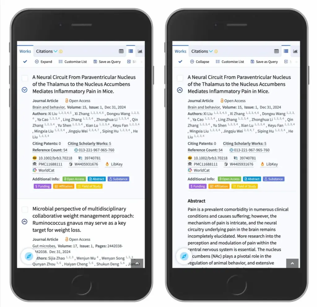
When designing user interfaces for the web, few components are as ubiquitous—or as frequently mishandled—as the accordion. Used widely to save screen space by expanding and collapsing content sections, accordions seem simple enough. Yet, a closer examination of visual design patterns reveals that minor choices regarding icons, arrows, and target hit areas can profoundly impact user experience and navigation efficiency. Recent usability research sheds light on what actually works when designing these common interface elements, offering clear takeaways for web designers and developers striving to build more intuitive digital environments.
At the core of the discussion is a fundamental user interface question: What icon is the most reliable choice to signal the expansion and collapsing of an accordion menu? For years, designers have debated the merits of various visual indicators, including carets, chevrons, standard directional arrows, and geometric triangles. According to comprehensive research findings from the Nielsen Norman Group (NN/g), subtle yet significant differences exist in how users interpret these symbols. More importantly, the study highlights critical flaws in common interface patterns—most notably, the inherent dangers of split menus and the confusion that arises when icons and text labels are programmed to trigger entirely different actions.
Understanding User Expectations: When No Icon Means Opening a Page
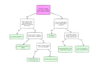
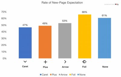
To understand how users interact with accordions, it helps to examine what happens when visual signifiers are missing altogether. Findings from usability evaluations indicate that users harbor predictable expectations based on the presence or absence of an icon. Specifically, when a menu item features no icon at all, users naturally assume that tapping or clicking on the text will take them directly to a brand-new page.
The research also demonstrates that users frequently struggle with custom icons. Because custom graphics lack universal standardization, they fail to clearly signal whether clicking them will expand an accordion or navigate elsewhere. Interestingly, eye-tracking and interaction studies show that users tap with roughly equal frequency on both the icon and the text label for the vast majority of standard icon types. This means that an icon choice does not merely serve as a passive visual indicator; it directly dictates the behavior of the entire interactive hit area.

Many modern web designs attempt to overcomplicate navigation by introducing elaborate systems of arrows and carets that shift direction or placement depending on the current state of the accordion. However, usability experts emphasize that designers rarely need to employ complex directional arrows just to indicate a link to a parent category. The golden rule of thumb remains remarkably simple: if a piece of text functions as a standard link to a new page, the most effective and universally understood method is to simply underline it. While an underlined link might lack decorative flair, it operates flawlessly and intuitively for users every single time, eliminating ambiguity entirely.
The Pitfalls of Arrows and Split Buttons
Among the most common missteps in interface design is the use of directional arrows to control expandable menus. Research indicates that using a right-facing arrow does not reliably align with user expectations of navigating to a new page. Similarly, placing the exact same arrow pointing downward does not intuitively communicate that an accordion menu will unfold upon interaction.
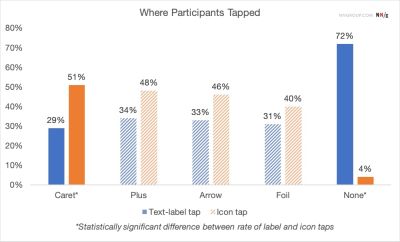
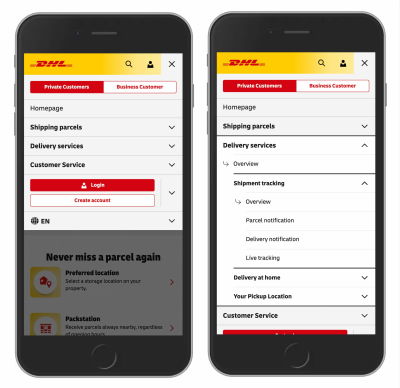
This ambiguity frequently leads designers down the path of implementing split buttons—an interface pattern where the text label links directly to a destination page, while the adjacent icon is assigned the separate task of opening the accordion. Usability testing consistently proves that split menus are harmful to the overall user experience. They routinely confuse users, who frequently click the wrong part of the component and wind up on an unexpected page or fail to expand the menu they wanted to view.
Instead of relying on split buttons, more reliable design patterns allow users to tap anywhere on a main category header to expose the sub-menu. To provide access to the category’s main landing page, designers can simply include an explicit "Overview" link directly inside the expanded menu itself. Major organizations and logistics platforms, such as DHL, have successfully adopted this streamlined approach in their real-world e-commerce and structural menus, completely eliminating unnecessary arrows and split interactions in favor of clear, predictable hierarchy.

The Dual Nature of Plus Signs and Traditional Arrows
Beyond carets, interface designers frequently turn to plus and minus symbols, or standard directional arrows, to denote expanded and collapsed states. While these symbols are generally understood by the average web user, they carry significant drawbacks stemming from semantic overload.
Plus and minus signs are heavily used across digital products for a wide variety of functions, ranging from zooming in and out of images to adding items to a shopping cart or saving content for later use. When applied to multi-level navigation menus where multiple sections might be opened simultaneously, these symbols can easily lose their contextual clarity.
Similarly, standard directional arrows are frequently overloaded with multiple meanings across different platforms. Users encounter arrows used for scrolling pages, sliding carousels, jumping to specific anchor points, or indicating pagination. While plus signs and standard arrows do function adequately in many contexts, their heavy reliance on multi-purpose meanings makes them prone to misinterpretation depending on the surrounding layout and user context.
Determining the Safest Choice for Modern Interfaces
Synthesizing the findings from extensive usability research, the safest and most reliable choice for accordion design is the downward-facing caret or triangle by default. Upon user interaction, this icon smoothly transitions to point upward or sideways, providing immediate visual feedback regarding the state of the content container. When an alternative is required, standard plus and minus signs generally perform well, provided they are implemented with clear contextual boundaries.
Ultimately, digital products benefit immensely from restraint. Complex arrangements of additional arrows or multi-tiered indicators are rarely necessary to show users where navigation links lead. By eliminating confusing split menus in favor of unified dropdown components that clearly show all available options, developers can significantly reduce user error rates. When a direct link is necessary, underlining the title remains the most time-tested and effective method for guiding user behavior. In the realm of web design, clarity consistently outperforms complexity.