











 Standard
Research Reveals the Most Reliable Icons for Website Accordions and Why Split Menus Fail Usability Tests
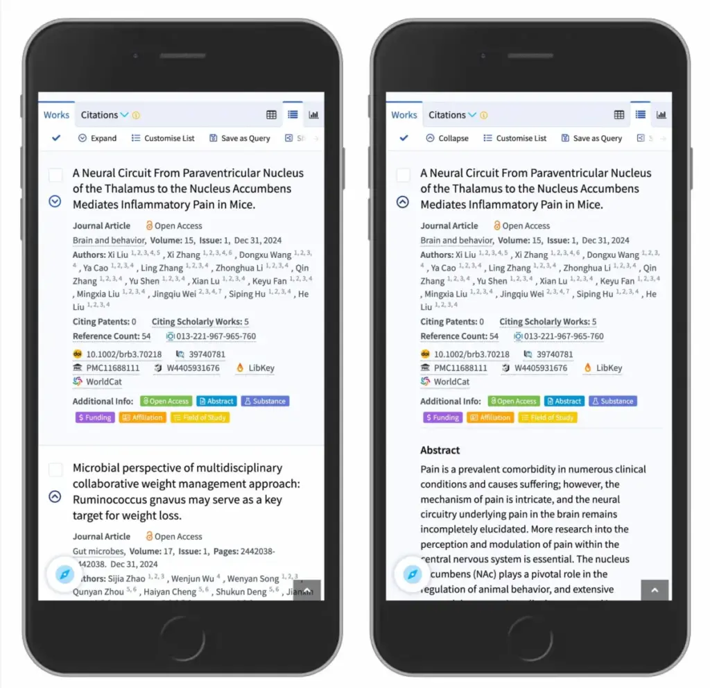
When designing user interfaces for the web, few components are as ubiquitous—or as frequently mishandled—as the accordion. Used widely to save screen space by expanding and collapsing content sections, accordions seem simple enough. Yet, a closer examination of visual design patterns reveals that minor choices regarding icons, arrows, and target hit areas can profoundly impact…