










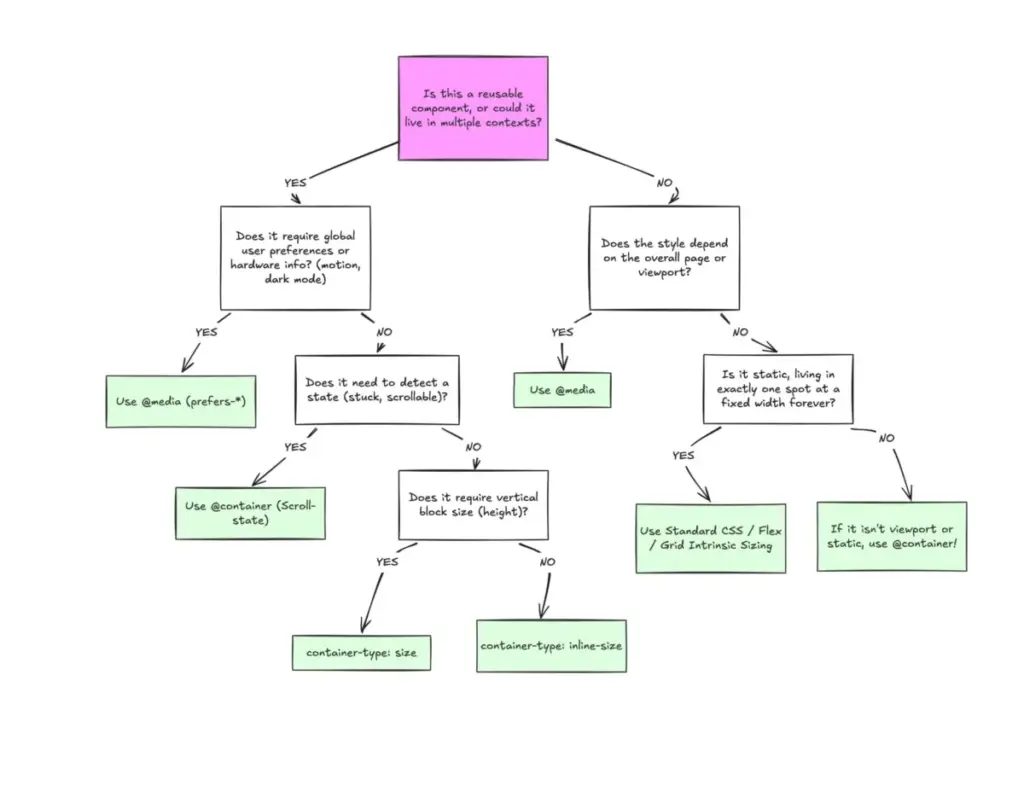
Despite achieving broad browser support that now sits at roughly 94 percent globally, CSS container queries remain surprisingly underused and frequently misunderstood across the web development industry. Years after their initial rollout, a significant gap persists between developer awareness and actual adoption. Industry surveys indicate that while the vast majority of developers know the feature exists, less than half actually implement it in production environments. This hesitancy highlights a deeper conceptual hurdle: because container queries share a syntax nearly identical to traditional media queries, many developers continue to view them as interchangeable tools rather than a fundamental evolution in responsive web design.
The reluctance to adopt container queries was recently highlighted at SmashingConf Amsterdam, where web developer and educator Kevin Powell pointed out that the overall adoption rates for container queries have been remarkably low. This strange paradox has caught many in the front-end community off guard, especially considering that the ability for individual components to adapt dynamically to the size of their outer container had sat atop developer wishlists for years. The capability addresses a fundamental architectural limitation that has defined responsive web design since the inception of media queries.
To understand why container queries are so frequently misapplied, it helps to examine how developers first encounter them. At a glance, a container query looks almost indistinguishable from a media query. Because the syntax uses a familiar structure, it is easy to assume they serve identical purposes. However, they operate on entirely different principles. While the focus of modern container queries centers primarily on size queries—responding to the specific dimensions of a parent container—experimental style queries are also emerging to evaluate computed styles. Yet, the core revolution lies in how size queries shift the paradigm of layout logic away from the global viewport.
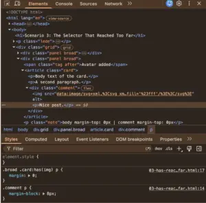
For decades, the viewport has served as a proxy for responsive design. Media queries conditioned developers to accept that screen width alone dictates how a digital application adapts to its environment. When writing a media query, a developer is simply asking the browser how wide the entire screen is at that exact moment. While media queries answer this question reliably for macro-level page structures, they fall short when applied to reusable components.
Consider a standard card component placed inside a narrow grid cell within a massive desktop monitor. A media query evaluating the viewport width will trigger styles meant for large screens, ignoring the fact that the actual card has only a few hundred pixels of horizontal space to work with. Eventually, elements within the confined space deform, overflow, or cramp up. As Powell famously noted, media queries are fundamentally limited because they lack deep contextual awareness, operating under the false assumption that screen width alone tells the whole story of available space.
Container queries introduce a smarter approach by looking inward rather than outward. Instead of asking how much space the global browser window provides, a container query asks how much space is available inside a specific local context right now. By registering an element as a container using properties like container-type: inline-size, developers allow components to respond dynamically to their immediate surroundings. A card component can thus evaluate whether its parent wrapper has enough horizontal room to display items in a row or if it needs to collapse into a vertical stack, regardless of whether it is viewed on a mobile phone or tucked away inside a desktop sidebar.

This distinction maps neatly onto the concepts of macro layouts versus micro layouts. Media queries remain the ideal tool for macro layouts, handling major page architecture, global grids, headers, footers, system preferences like color schemes, and hardware capabilities such as touch screens. Container queries, by contrast, excel at micro layouts—the intricate components that live inside those macro structures, such as cards, widgets, forms, and navigation modules. Rather than forcing an element to become tablet-sized simply because an abstract global threshold like 768 pixels has been crossed, container queries allow components to shift their layout the moment localized space permits it. This shift is increasingly vital on the modern web, where analytics reveal thousands of unique viewport sizes that make rigid global breakpoints nearly impossible to manage comprehensively.
The benefits of this inward-looking approach extend directly into typography and internal layout tracking. Historically, responsive typography relied heavily on viewport-relative units like vw or vh combined with scaling functions. While effective at the page level, these units break down when a component is relocated to a confined sidebar where the viewport is irrelevant. Container queries introduce specialized relative units—such as cqi and cqw—which can be paired with CSS functions like clamp() to achieve fluid typography that scales directly with the component’s container rather than the browser window.
Furthermore, container queries offer sophisticated workarounds for tracking internal layout states, such as flexbox wrapping. Traditional media queries are structurally blind to internal layout events, such as when flex items wrap onto a new line, because they only observe the outer browser window. By combining container queries with flexible sizing rules on container elements, developers can detect when a component’s internal layout shifts from a wrapped state to a full-row state without having to rely on heavy JavaScript observers.

Despite these powerful advantages, container queries do introduce specific side effects and architectural caveats that developers must navigate. First, a container cannot query its own dimensions; attempting to declare a container and immediately query it for its own styling creates an infinite loop. Instead, a separate parent wrapper is required so that child elements can respond to the container’s boundaries.
Second, querying a container’s block size—its vertical dimension—without defining an explicit height or aspect ratio can cause the layout to collapse to zero pixels, as browsers calculate these dimensions independently of the children’s content. For this reason, developers frequently rely on inline-size queries to avoid unintended layout failures. Finally, container queries cannot currently evaluate custom properties directly, as cascading variables introduce potential loops that the CSS engine cannot safely resolve.
Ultimately, the sluggish adoption of container queries stems from a mix of ingrained habits and superficial familiarity. Rather than replacing media queries entirely, container queries fill a critical gap in modern component-driven development. By understanding the clear separation of concerns between macro page layouts and micro component containers, developers can leverage container queries to build truly resilient, context-aware interfaces that adapt naturally wherever they are placed.