











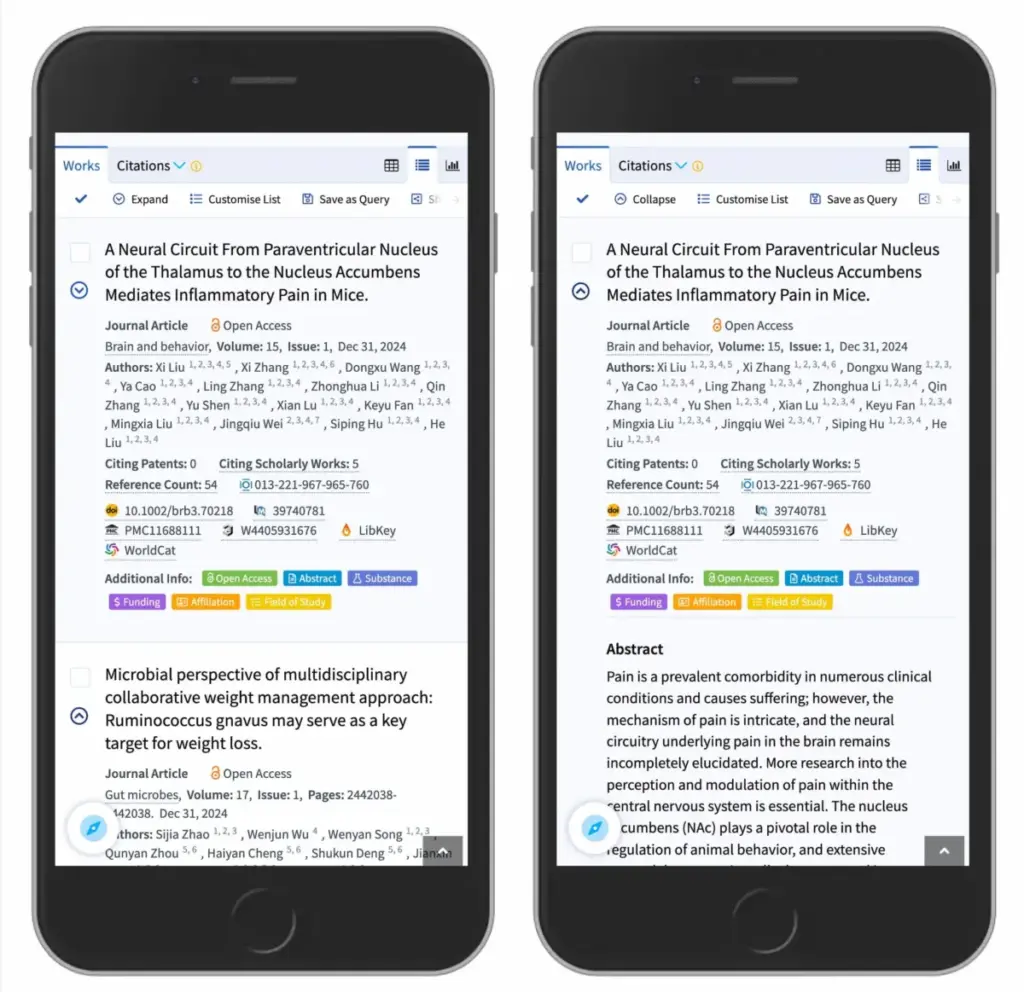
When designing digital user interfaces, even the smallest visual details can carry profound weight. Among the most common UI components on the modern web is the accordion—a vertically stacked list of headers that users can click to expand or collapse and reveal associated content. Yet, despite their widespread implementation across e-commerce platforms, documentation sites, and complex navigation menus, a fundamental design question continues to spark debate among user experience professionals: What icon is the most reliable to signal expansion and collapsing? Is there truly a noticeable difference between carets, chevrons, arrows, and triangles?
Recent usability research from the Nielsen Norman Group (NN/g) provides a definitive look into these questions, offering deep insights into how users interpret interface cues. Beyond simply determining which icon performs best, the research highlights critical pitfalls in modern web design, including why split menus are fundamentally harmful, why separating the actions of an icon and a text label creates friction, and why the humble caret remains the safest choice for designers navigating the complexities of information architecture.
Understanding User Expectations When No Icon is Present
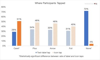
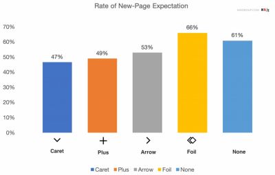
To understand how icons influence behavior, researchers first examined how users react to menu items devoid of any visual indicators. The findings reaffirm long-standing interface design conventions: without an explicit icon, users overwhelmingly expect that tapping or clicking on a menu item will transport them directly to a new page.

The study indicates that users frequently struggle with custom or heavily stylized icons because these novel graphics fail to create an immediate, universally understood mental model that an accordion will open. Furthermore, behavioral tracking reveals that users tend to tap fairly equally on both the icon and the adjacent text label for the vast majority of standard iconography. This means that an icon choice does not merely serve as a passive visual signal; it actively defines the interactive hit area for the entire component.

Many contemporary web designs attempt to overcomplicate interaction patterns by dynamically altering arrows and carets to point in multiple directions depending on the current state of the accordion. However, usability data suggests that designers rarely need to employ complex directional arrows just to indicate that a header links to a primary category page.
Instead, the golden rule of thumb remains remarkably simple: if a text label represents a direct link to a destination page, the most effective and universally understood method is to simply underline it. While an underlined link may lack visual novelty, it communicates interactivity flawlessly across every demographic and device type, completely eliminating user hesitation.
Navigating the Confusion Caused by Arrows and Split Buttons
The research also sheds light on the ambiguous nature of directional arrows. Utilizing a right-facing arrow icon does not consistently trigger a user expectation of navigating directly to a new page. Similarly, flipping the exact same icon so that it points downward does not inherently guarantee that users will anticipate an accordion unfolding upon interaction.
More concerning is the persistence of split buttons within accordion designs—a pattern where the text label links directly to a separate landing page while the accompanying icon independently controls the opening and closing of the accordion menu. Usability testing demonstrates that split menus are actively harmful to the user experience. They routinely cause user error, frustration, and misclicks, as users struggle to predict which half of the component will execute which action.

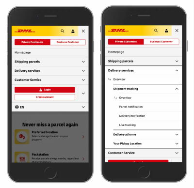
A far more reliable architectural pattern involves allowing users to tap anywhere on the main category header to expose the hidden submenu. To provide access to the overarching category page itself, designers can integrate a dedicated link, such as an "Overview" page, directly inside the expanded menu. Major digital platforms, such as international logistics provider DHL, successfully employ this streamlined approach in their navigation systems, completely omitting unnecessary directional arrows and split menus in favor of clarity and predictability.
The Overloaded Meaning of Plus-Minus Symbols and Arrows
Beyond carets, digital interfaces frequently rely on plus and minus symbols or vertical arrows to signal expanded and collapsed states. While these symbols generally function well enough for users to comprehend their basic mechanics, they suffer from a significant drawback: they are heavily overloaded with alternative meanings.
The plus symbol, for instance, can signify a wide array of actions depending on the context of the application. Users might interpret a plus icon as a command to save content for later, add an item to a shopping cart, or zoom into a high-resolution image. This ambiguity becomes particularly problematic within multi-level navigation structures where multiple tiers of menus might remain open simultaneously, leaving users uncertain about the hierarchical relationship of the content.
Similarly, vertical arrows can imply scrolling behavior, sliding mechanisms, searching for the next matching text string, or jumping instantly to a specific anchor point on a long page. While plus symbols and arrows are well-understood by most web users, their inherent versatility makes them susceptible to misinterpretation in complex environments.
Establishing Best Practices for Accordion Design
Synthesizing the empirical data from usability evaluations, the safest and most resilient design choice is to use a downward-pointing caret or triangle by default, transitioning it to point upward or sideways upon user interaction. If a project requires a functional alternative, standard plus and minus symbols generally perform reliably as well, provided the context prevents dual interpretations.
Ultimately, web designers do not need to clutter interfaces with redundant icons or aggressive arrows to explain where links lead. Split menus should be avoided entirely, as they consistently generate more user friction than utility. By adopting a unified button or dropdown mechanism that performs a single, predictable action—revealing nested options and allowing users to drill down naturally—designers can drastically improve digital accessibility and comprehension. When a direct page link is genuinely required, styling the title as an underlined hyperlink remains the most foolproof approach, proving once again that in user experience design, simpler is almost always better.